one of my favorite take-aways from living in amsterdam for six years was the notion of “gezellig,” the dutch word for “coziness,” also encompassing social concepts like inviting or friendly. i loved the idea of a “gezellig” meal (roast chicken for me) or a “gezellig” afternoon (sitting out the rain at my beloved chocolate shop, pompadour) or a “gezellig” cuddle with my children (lots of blankets and story books piled onto the sofa), but i was most fascinated with the “gezellig” interiors of the dutch apartments.
when we moved back to the states to boulder, colorado, i wanted to create my own “modern gezellig” in my family home, and later, in the homes of my clients. a modern space can be warm and inviting, as well as minimal and simple. including family or heritage pieces, mementos from travels, or art and photos with personal meaning in the mix with clean, pared-down furnishings give spaces intriguing contrast, depth and texture … modern gezellig.
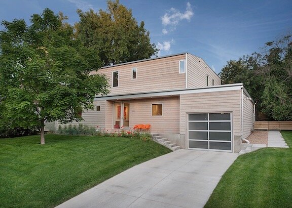
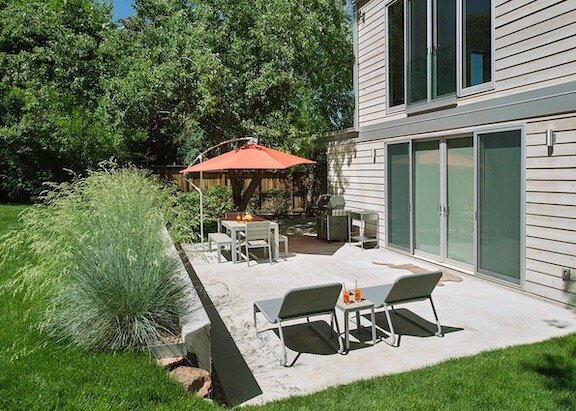
in an extensive remodel, our new boulder home was taken down to the studs and given a fresh interior layout by local architect, brad burch of INDEX AD, who reworked all of the living spaces and moved the bedrooms upstairs to maximize functionality and light. the exterior was redesigned with simple lines and covered in gray-washed cedar siding. kevin morningstar of morningstar homes actualized burch’s design and built our house.
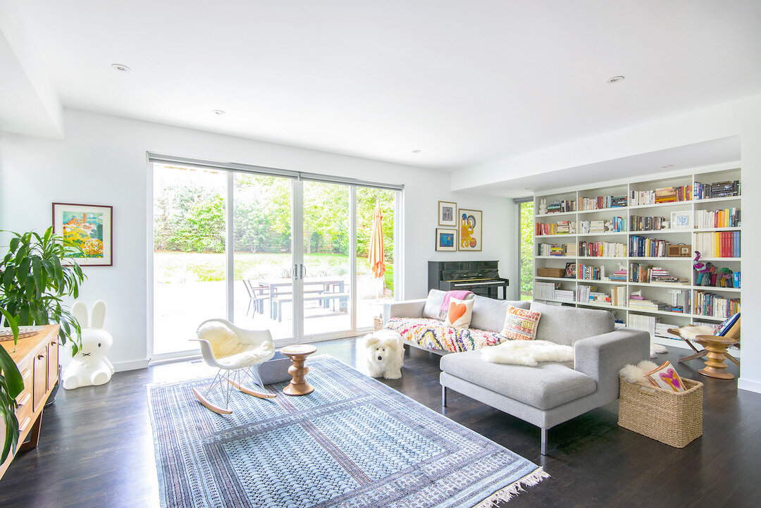
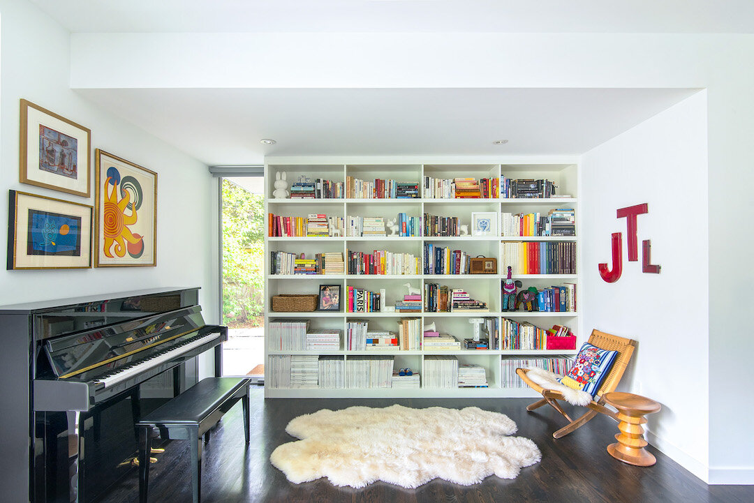
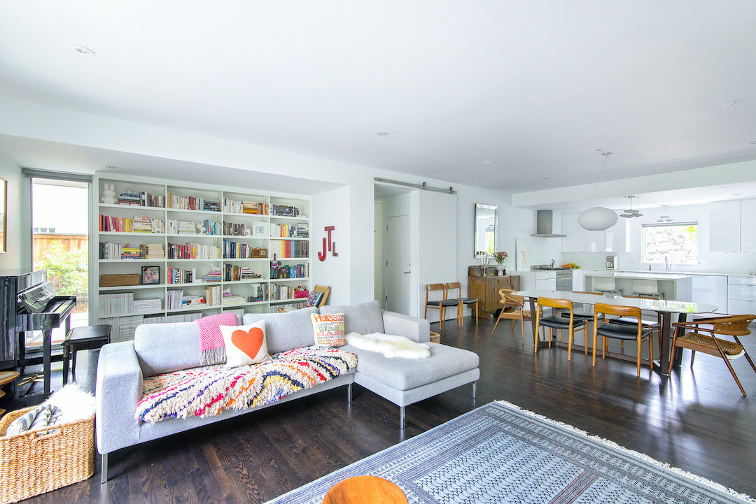
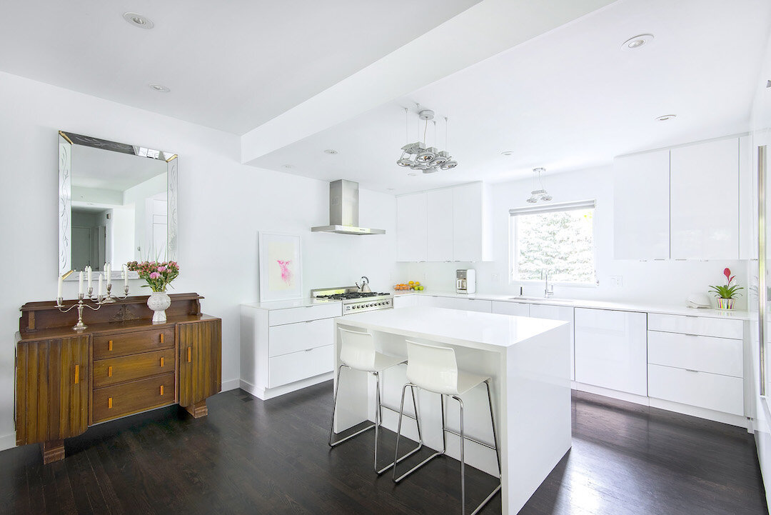
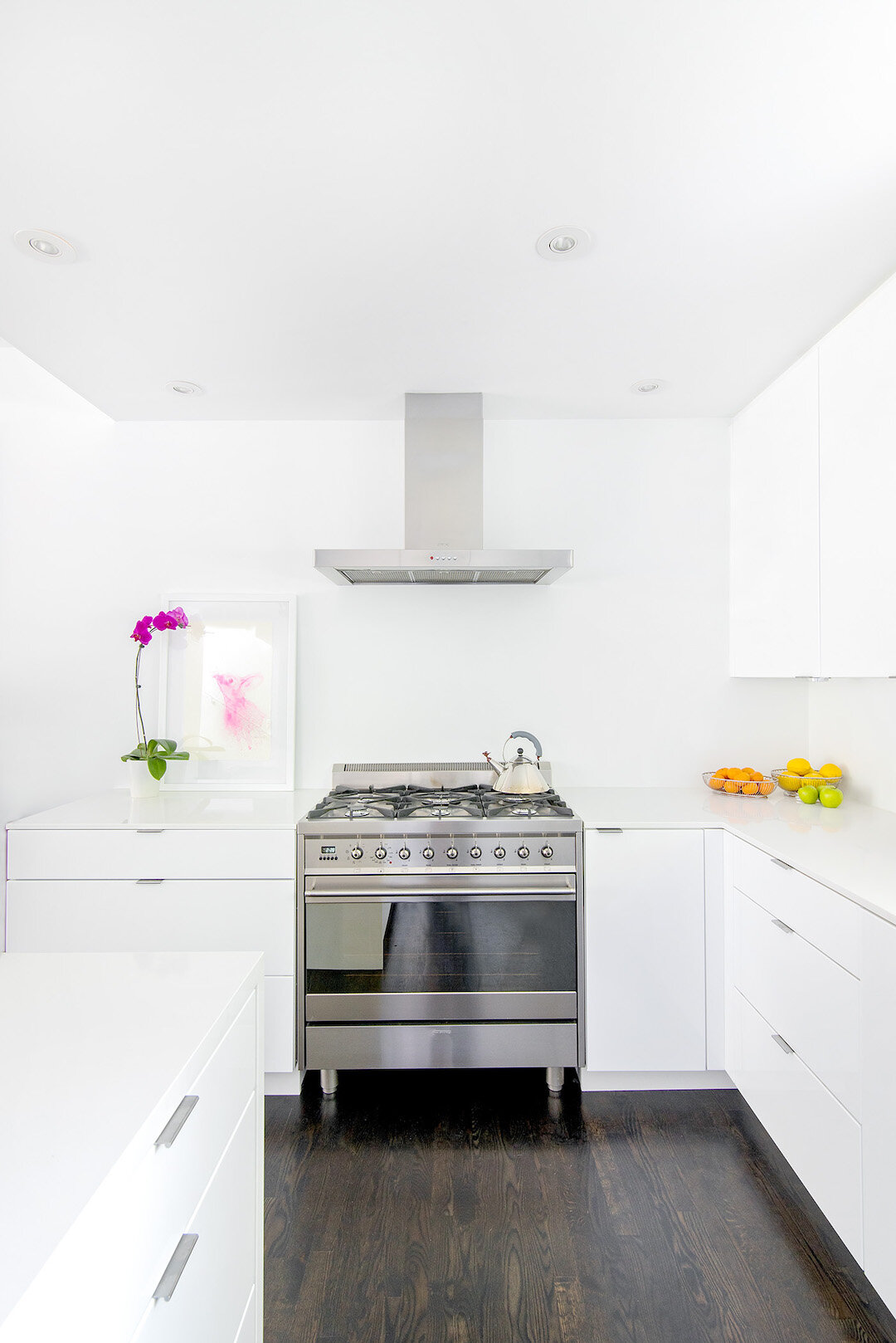
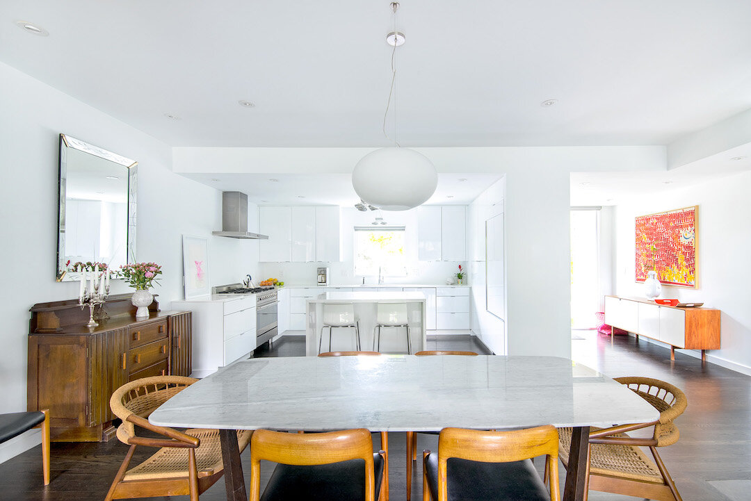
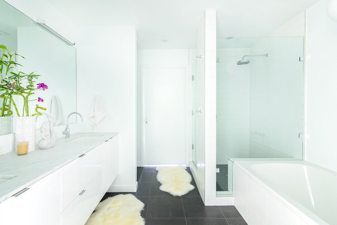
we chose a streamlined, graphic interior palette of ebony floors and white walls in a nod to our amsterdam apartment and to serve as a neutral backdrop for our eclectic and colorful mix of furniture, textiles and artwork. to provide consistency, only two tiles were used throughout the home - a dark charcoal slate and easy, white subway tiles. white thermafoil cabinets were used in both the kitchen and all three bathrooms.
(ebony floors and white walls)
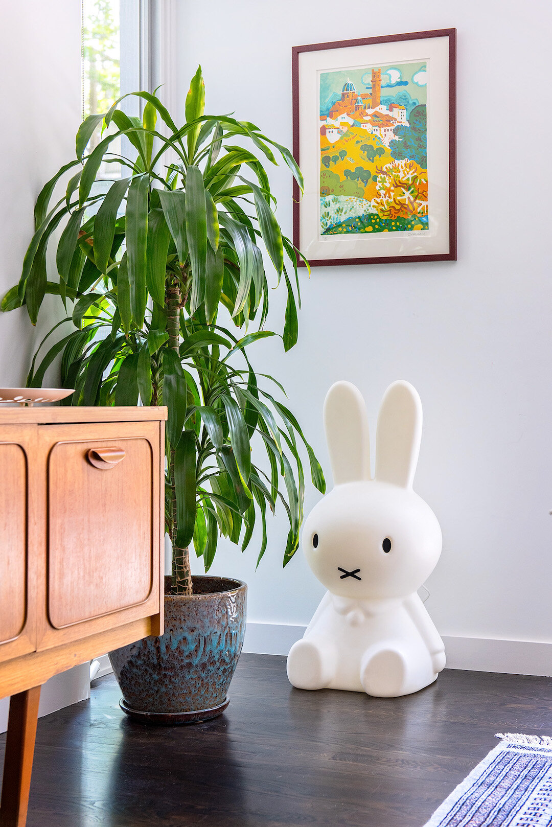
(“nijntje” bunny light - the beloved dutch character created by dick bruna)
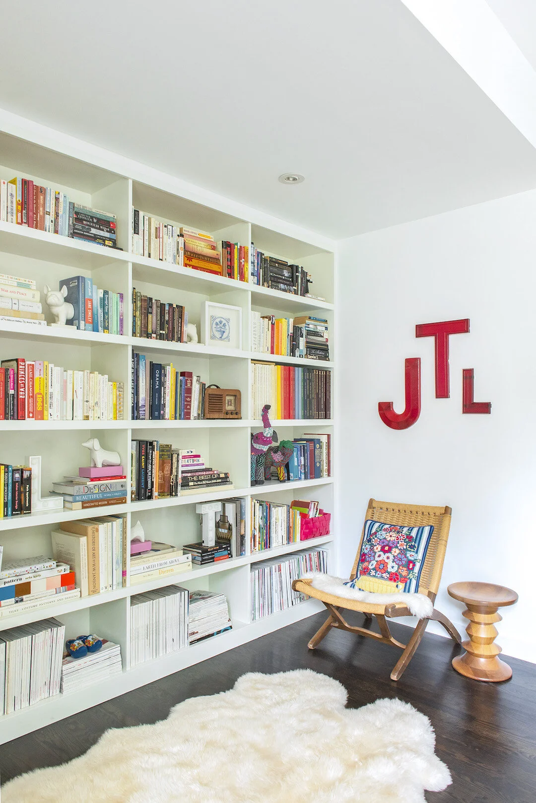
(the bookshelf filled with family mementos)
(all white kitchen, bunny watercolor by shayna larsen)
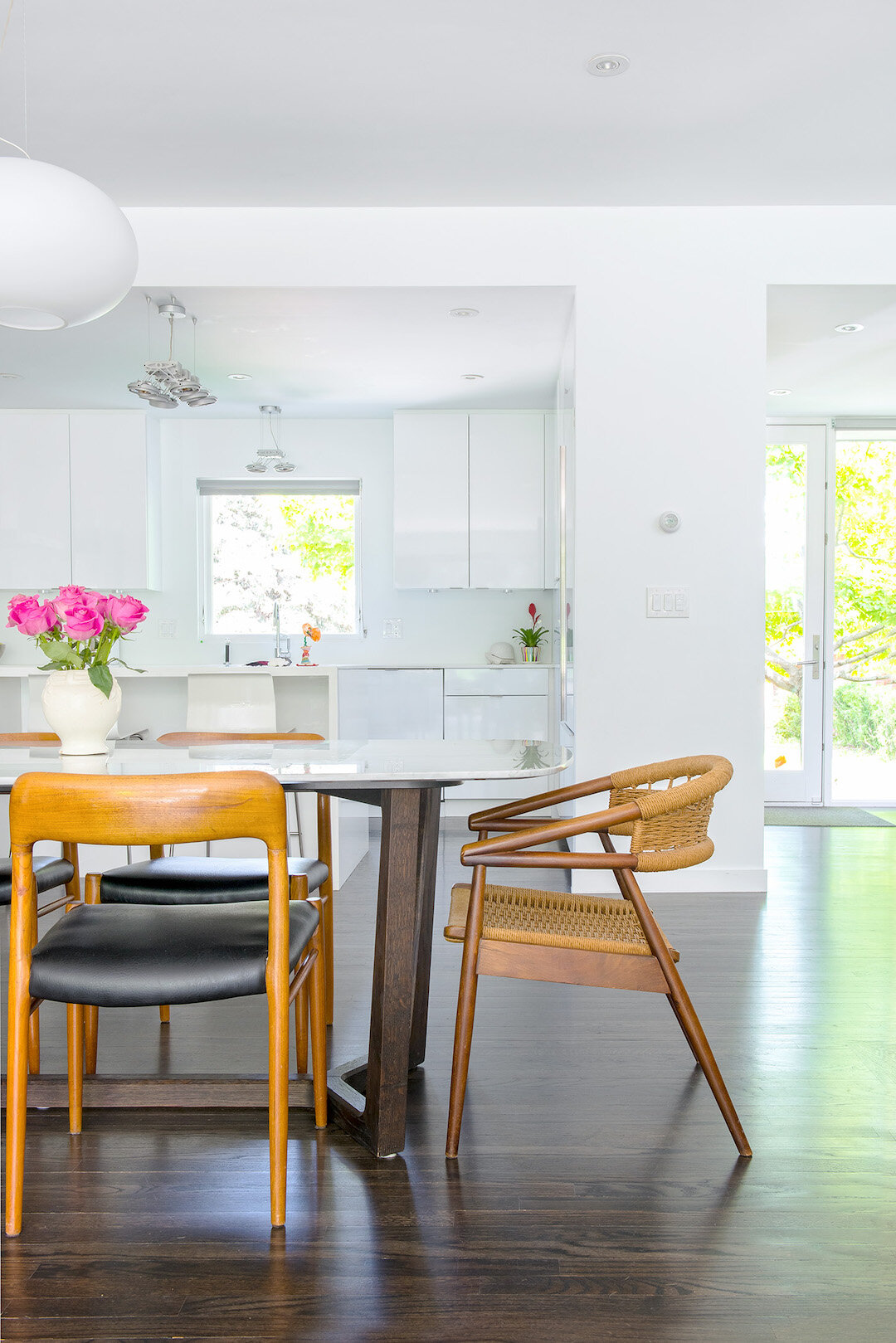
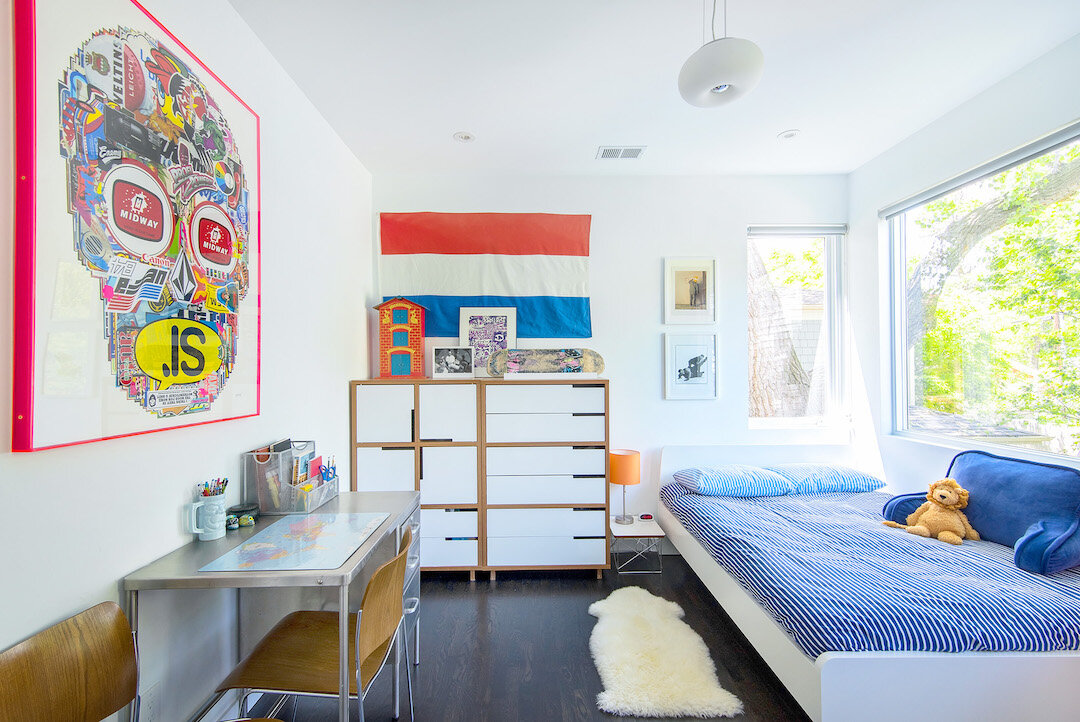
the furniture is a mix of new and vintage mid-century pieces (moller dining chairs, knoll entry credenza, wegner rope chairs, danish media credenza, eames stools and rocker), antiques (1930’s sideboard with bakelite pulls and engraved mirror, persian rugs passed down from my family, a steel nurse’s desk, my grandmother’s writing table) and contemporary furnishings (a poliform concorde marble dining table, a ben sen sofa, a pair of bludot modulicius dressers.)
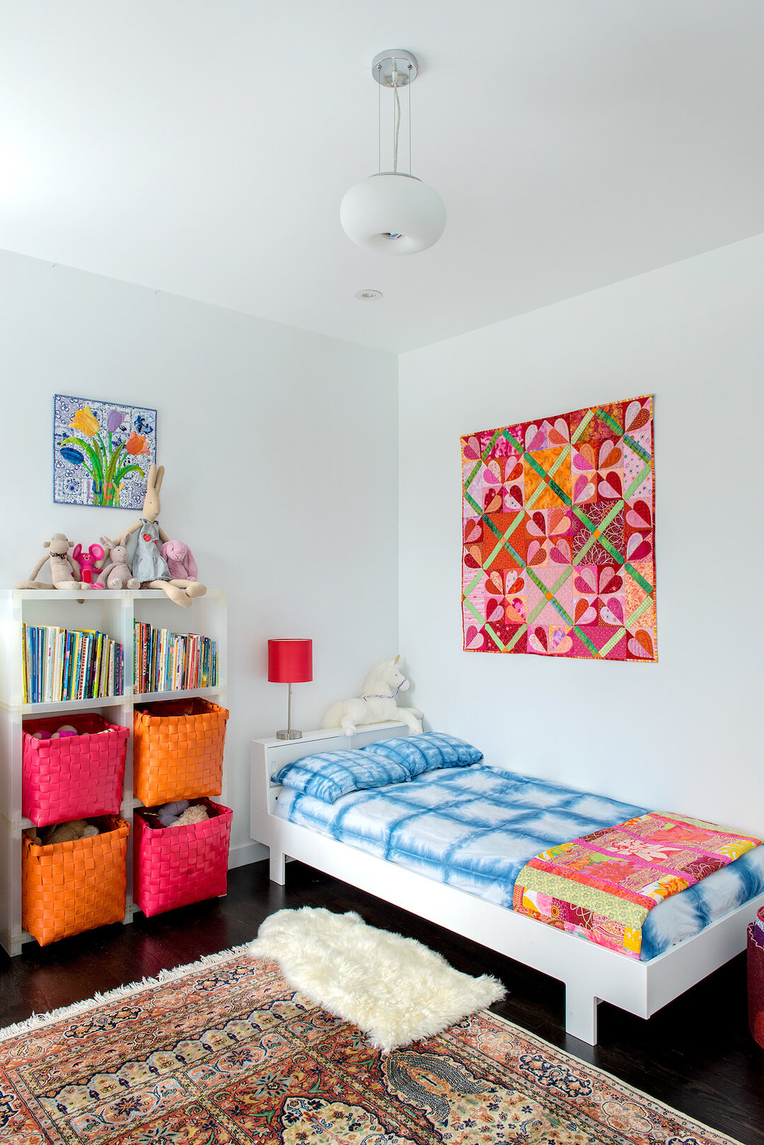
the walls are punctuated with pops of color and brought to life by our high/low collection of art, family textiles (quilts by my mother and a crocheted piece by my grandmother sewn onto a canvas) and paintings by artists we’ve been drawn to over the years (works by dutch artist wil weigart and boulder locals sarah kinn and shayna larsen.) we’ve also incorporated pieces created as a family (a colorful striped canvas in the stairwell) and lots of the children’s art. as such, our home tells the story of our family with simplicity and modern gezellig.
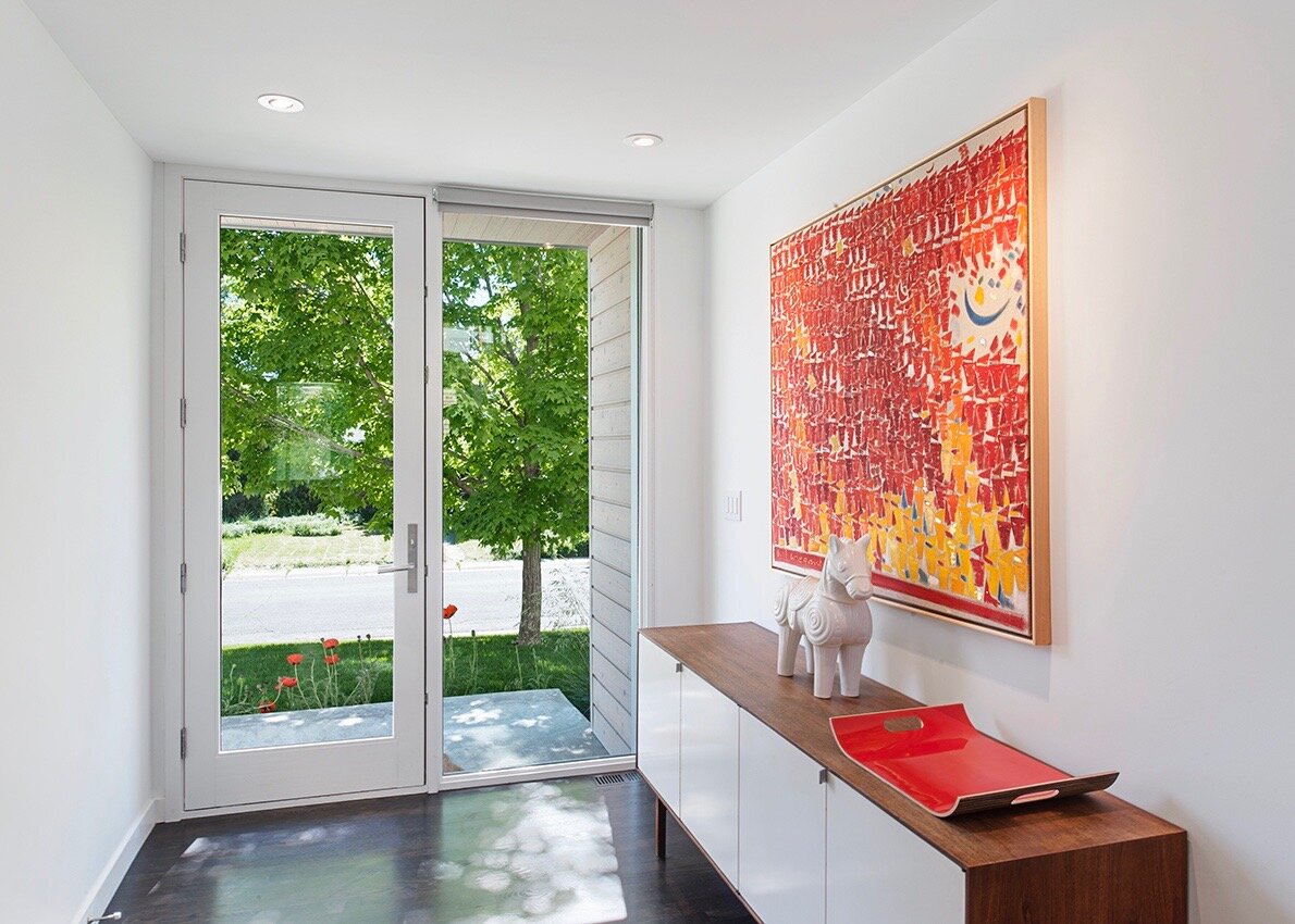
(vintage knoll credenza topped by a wil weigart oil painting)
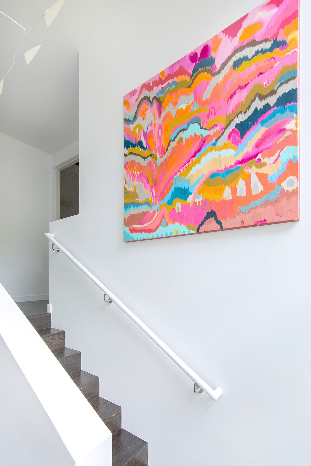
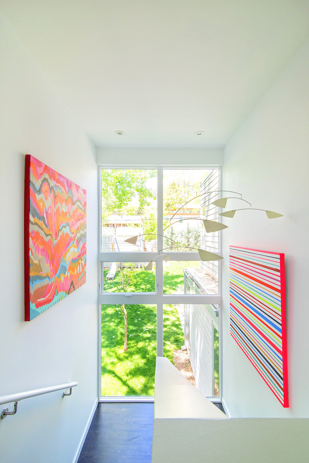
(sarah kinn’s abstract hangs in the stairwell)
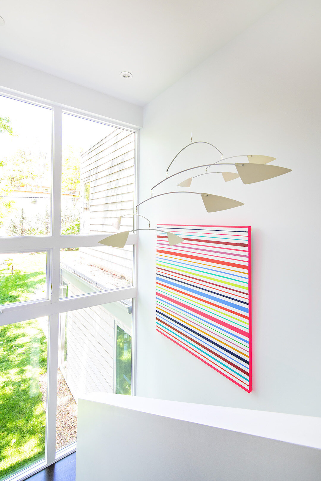
(a striped family collaboration piece painted with my children)
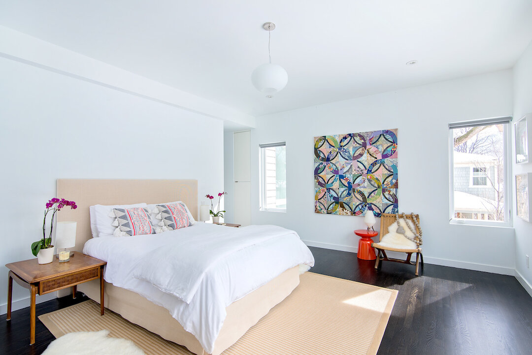
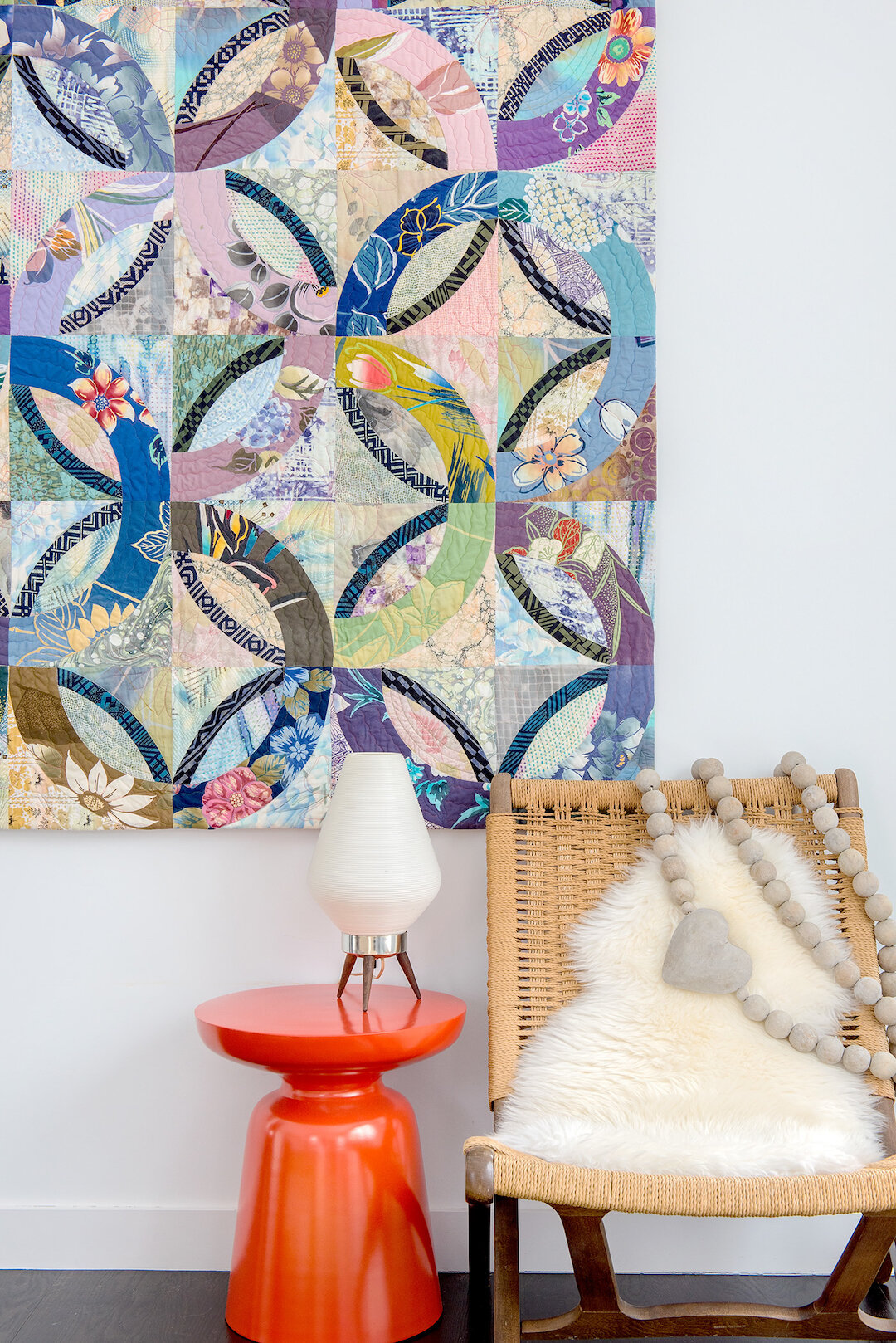
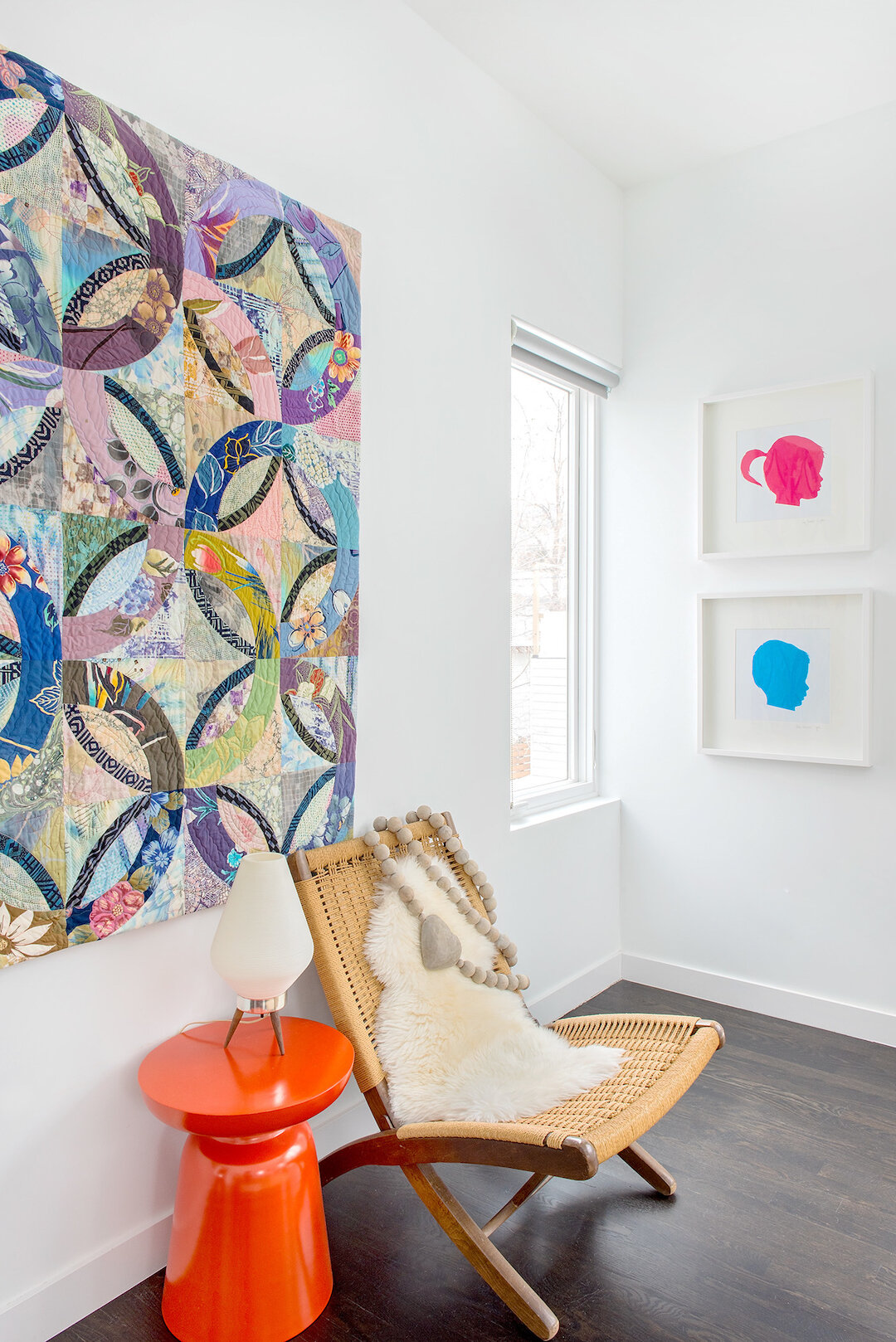
(a double wedding ring quilt by my mother hangs in my bedroom)
(colorful silhouettes of my children)
(a moller bench and trolley grounds pixelated prints we created from favorite photos)
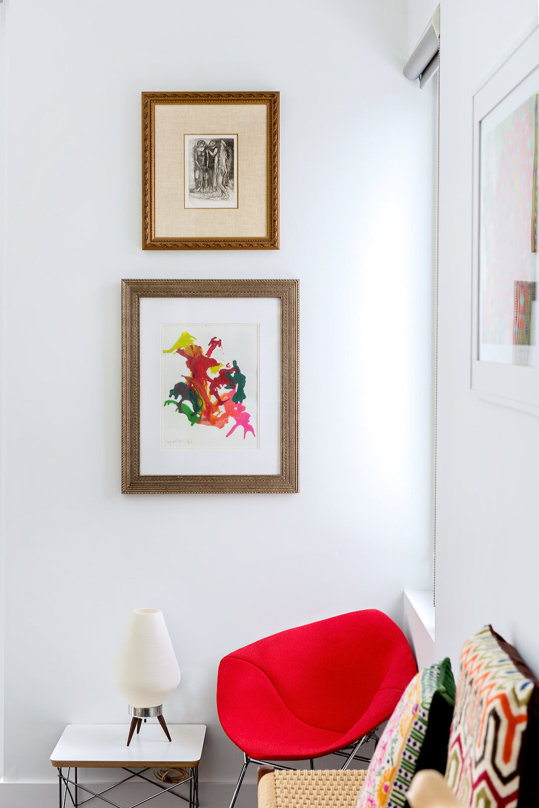
(a melted crayon piece by my daughter paired with an engraving)
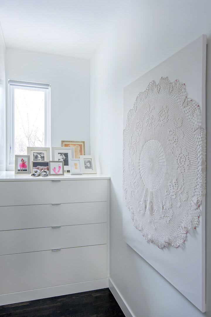
(a doily crocheted by my grandmother mounted on canvas and hung in the closet area)
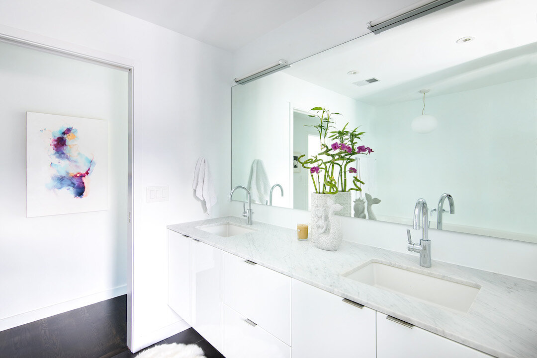
(the master bath, abstract alcohol ink by shayna larsen)
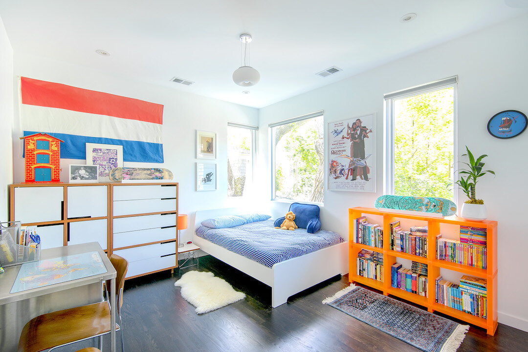
(my son’s room, vintage steel nurse’s desk and bludot dressers)
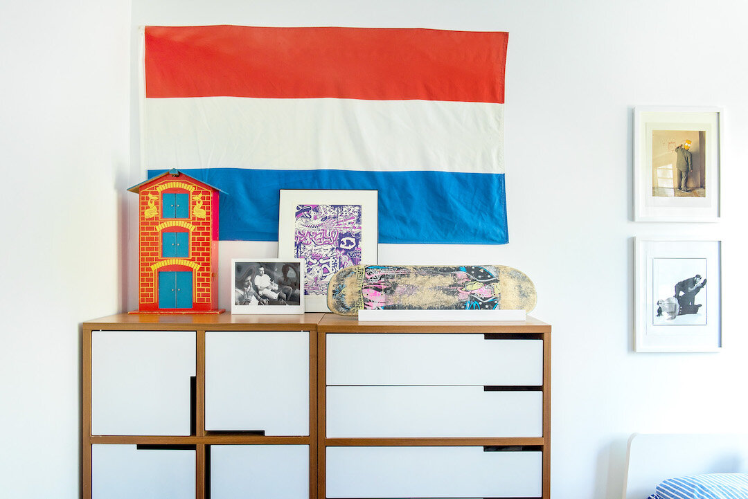
(a dutch flag and an antique canal house above his dressers to represent his birth city of amsterdam)
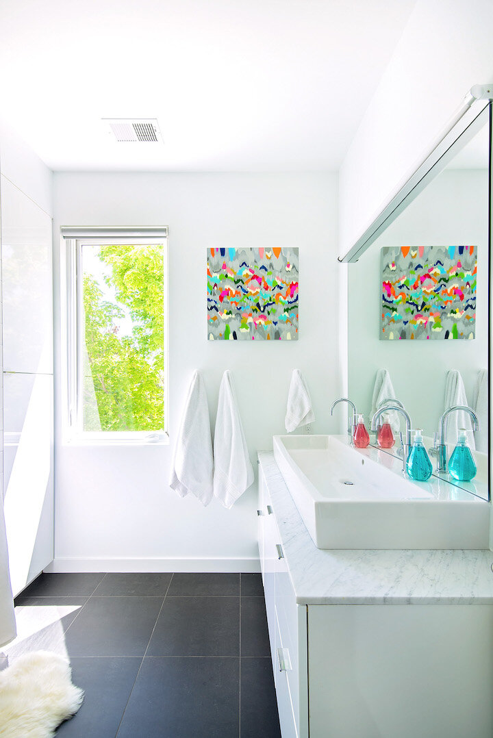
(a smaller sarah kinn piece hangs in the kids’ bathroom)
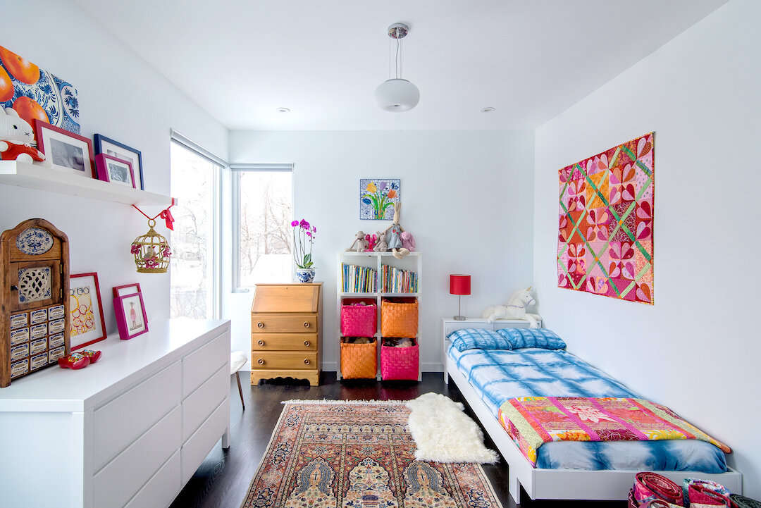
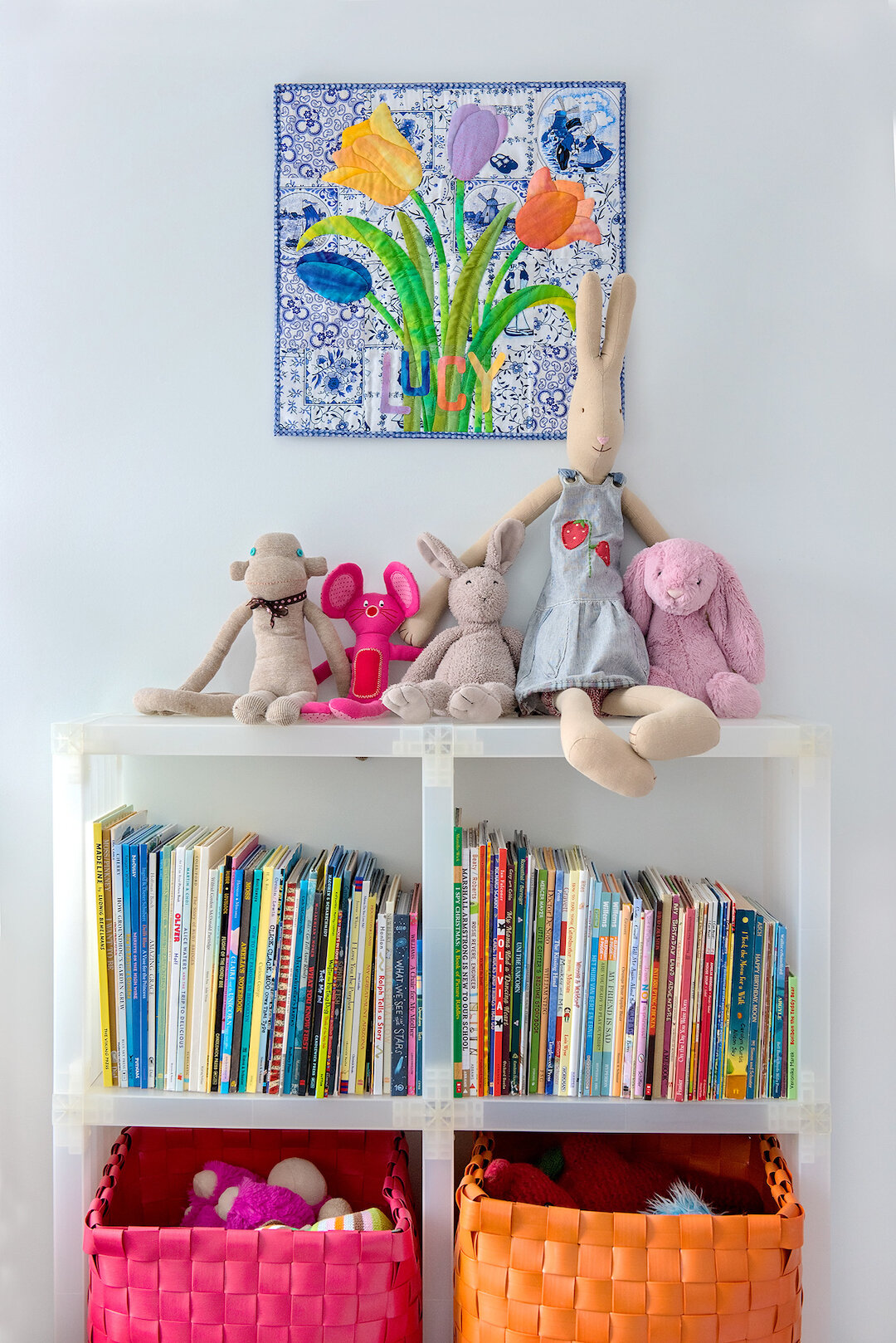
(my daughter’s room is filled with dutch references (nijntje bunnies, delft blue and white and tiny wooden shoes) as well as her great grandmother’s writing desk and several quilts and textile pieces made by her grandmother)
exterior photos: bob carmichael
interior photos: HBK photography
to read about other projects with “modern gezellig” click here or here or here.

