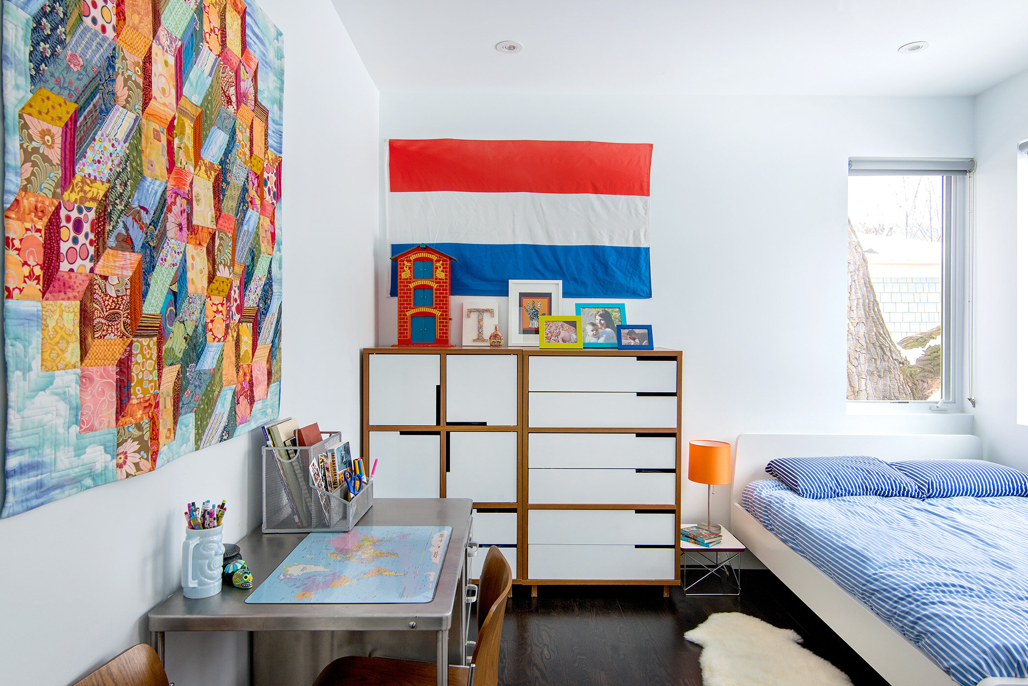
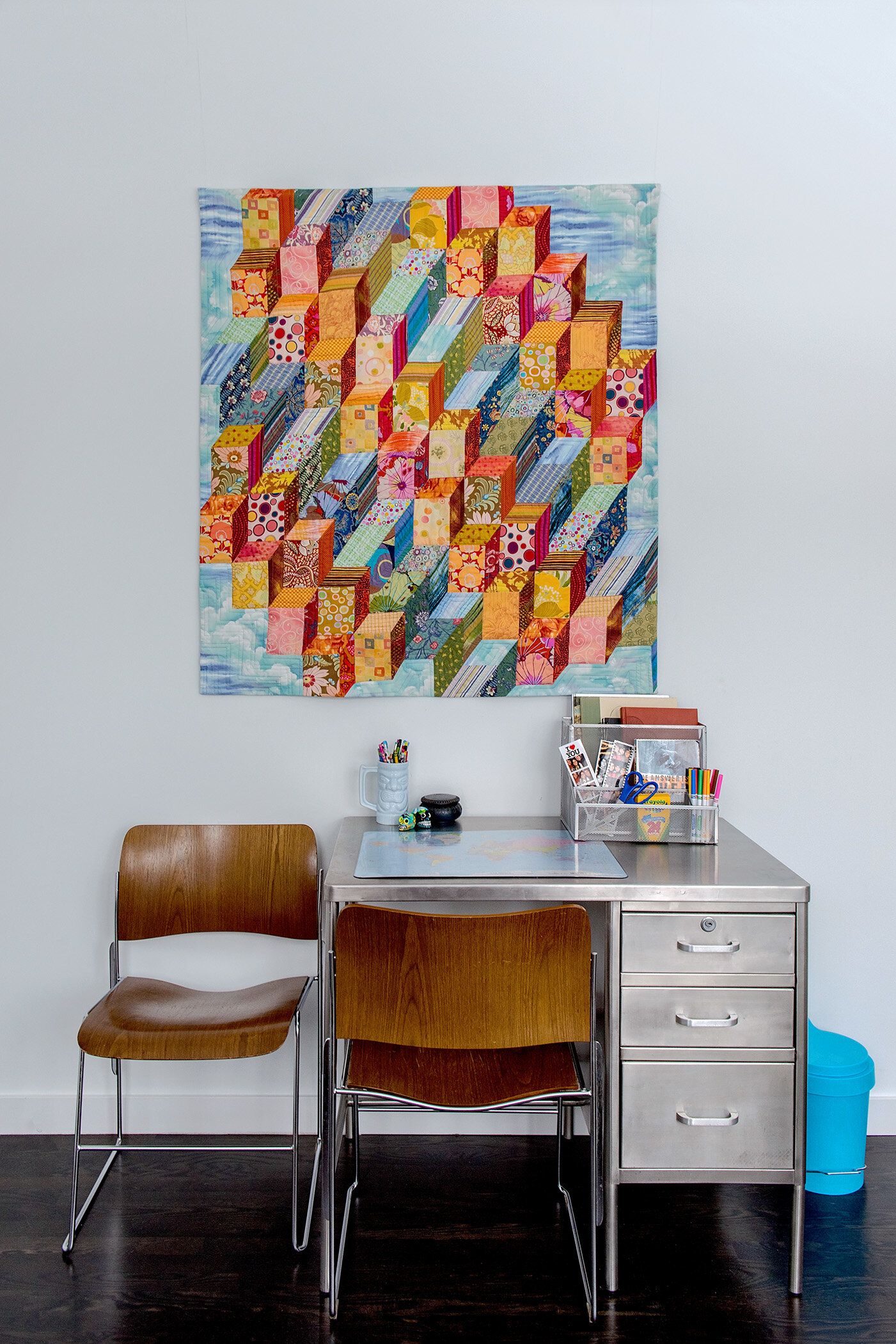
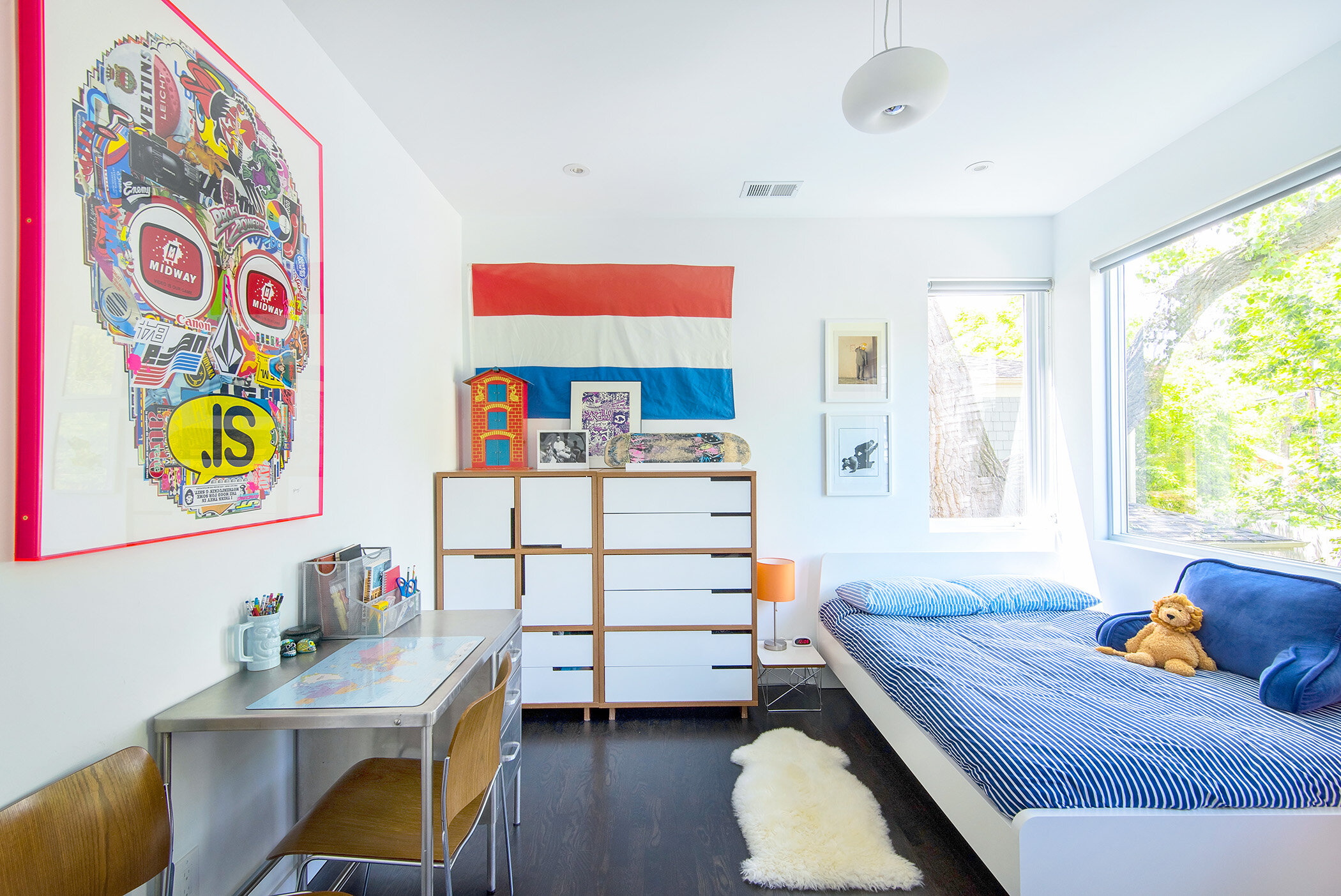
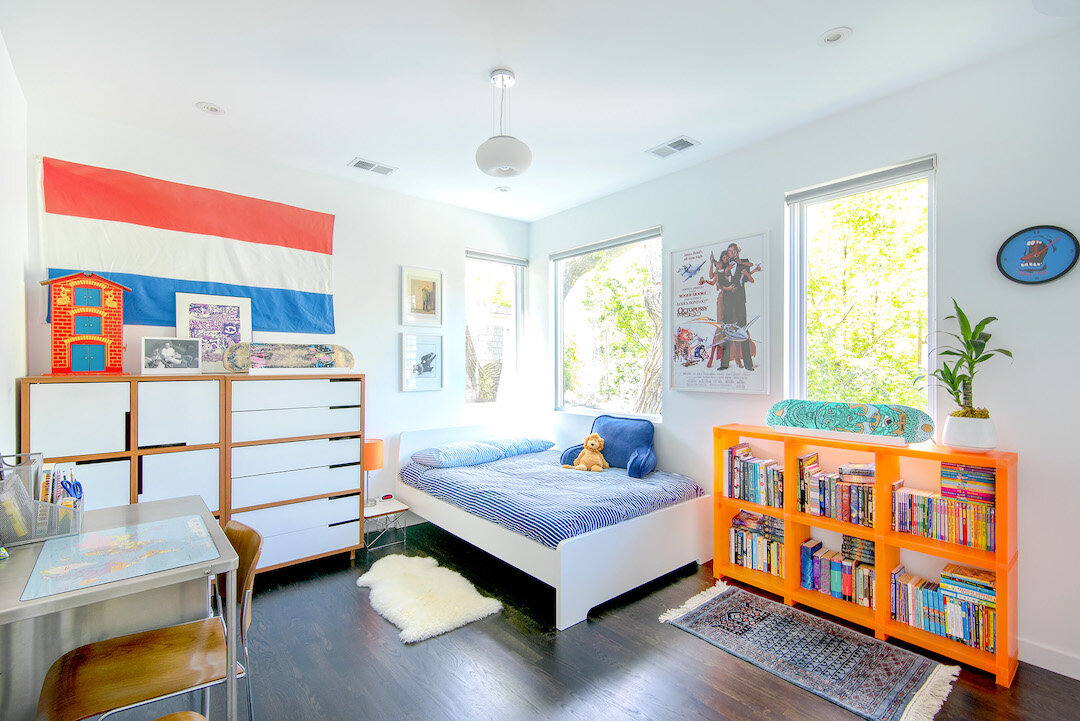
when designing the baby room for my first child, we repurposed a pair of walnut bludot dressers we had used for years in our own bedroom, as well as a vintage steel nurse’s desk from an office we no longer needed. we flushed the room out with a simple, white crib and changing table from ikea and hung bright, happy artwork on the walls. as my son got older, we replaced the crib for a toddler bed and later a “grown up” bed, updated the posters and art on the walls to reflect his changing interests (he shifted from a love of animals to james bond and skateboarding.) to this day the dressers and desk have remained in his room - he is now fourteen.
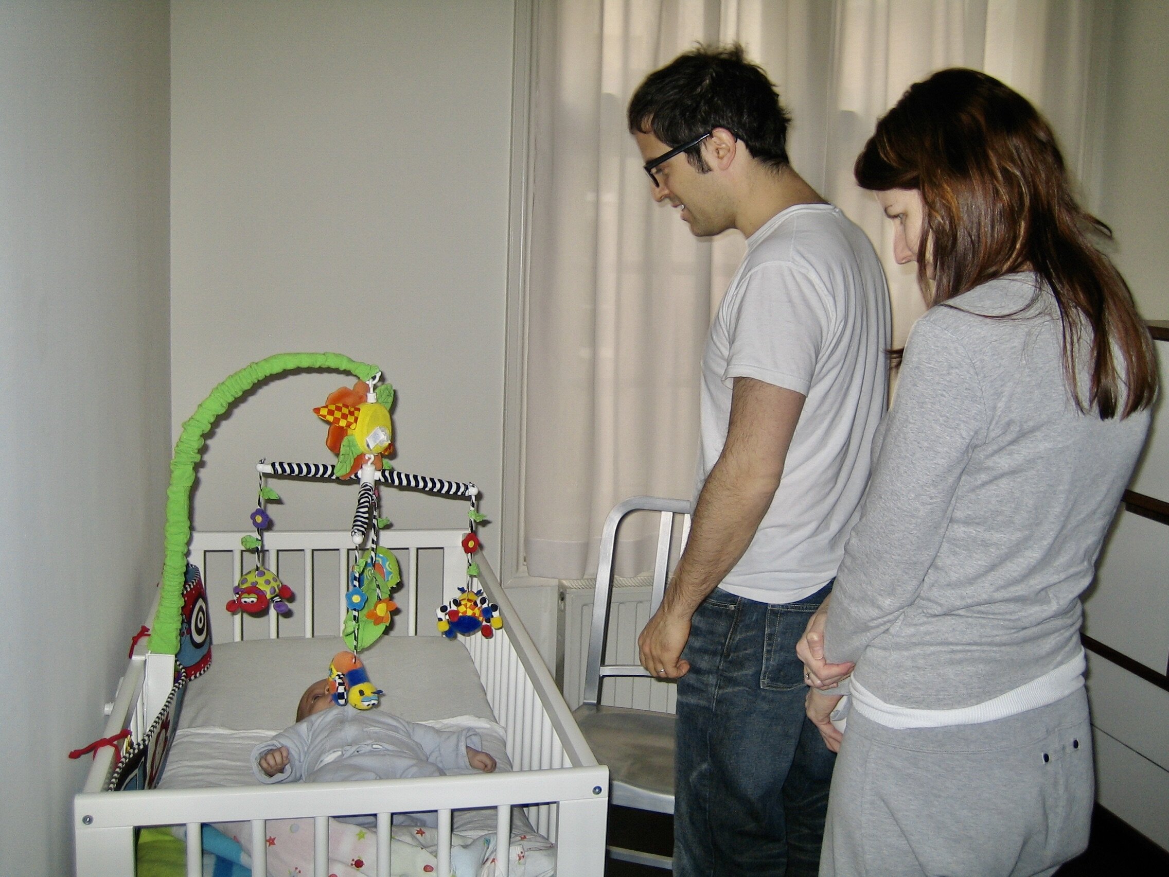
(newborn theo in his ikea crib… we [completely disheveled new parents] are amazed that he is quiet and looking at his mobile)
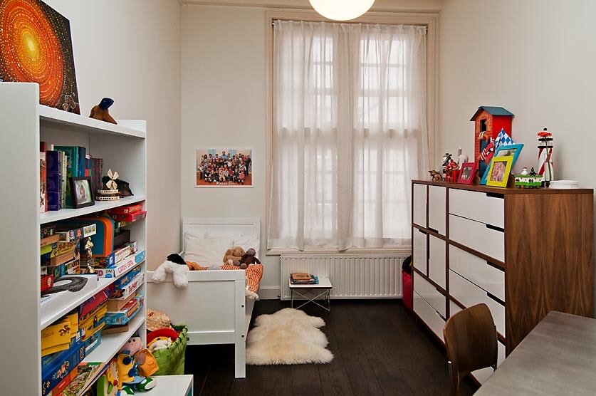
(theo’s room in amsterdam after he got a toddler bed)
(theo was pretty excited about his new bed!)
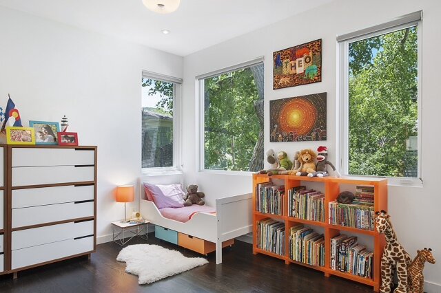
(theo’s new room in boulder… all of the same elements; photo: bob carmichael)
(updating theo’s room to include a full sized bed)
(he still has the quilt by my mother hanging over the vintage steel nurse’s desk)
(redecorating the room to include a skull art piece created from vintage stickers…)
(and a james bond poster, rather than the animal artwork)
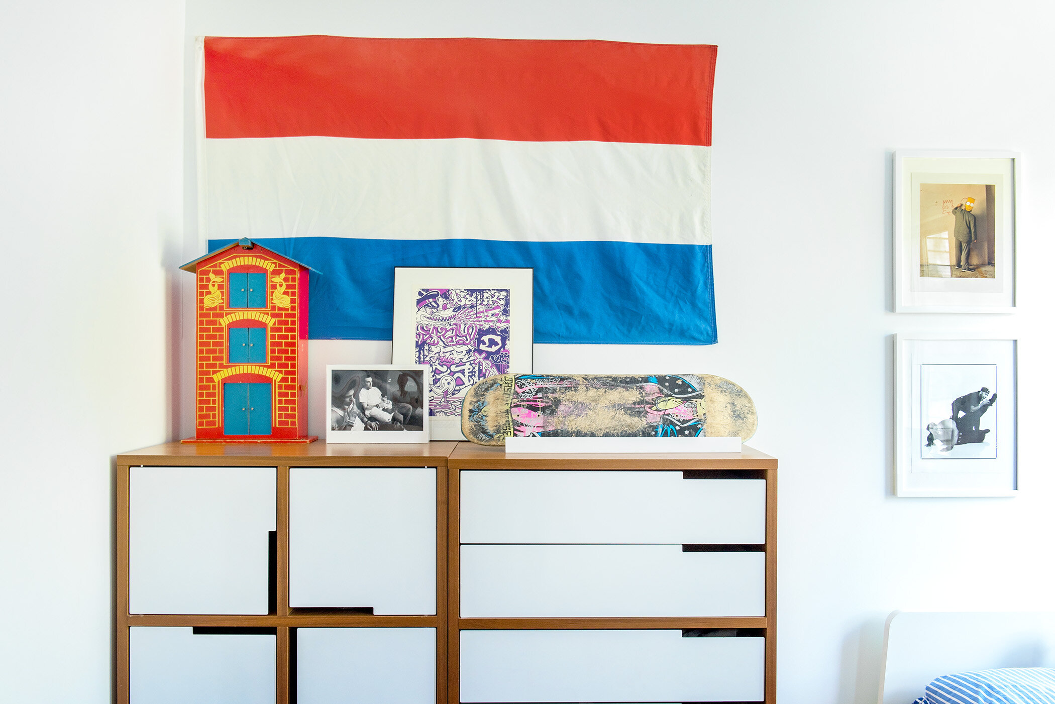
(he kept the dutch flag and canal house, but swapped out the family photos for his skateboard and more grown up art… that DID hurt my feelings a bit… there WAS a really sweet picture of the two of us!)
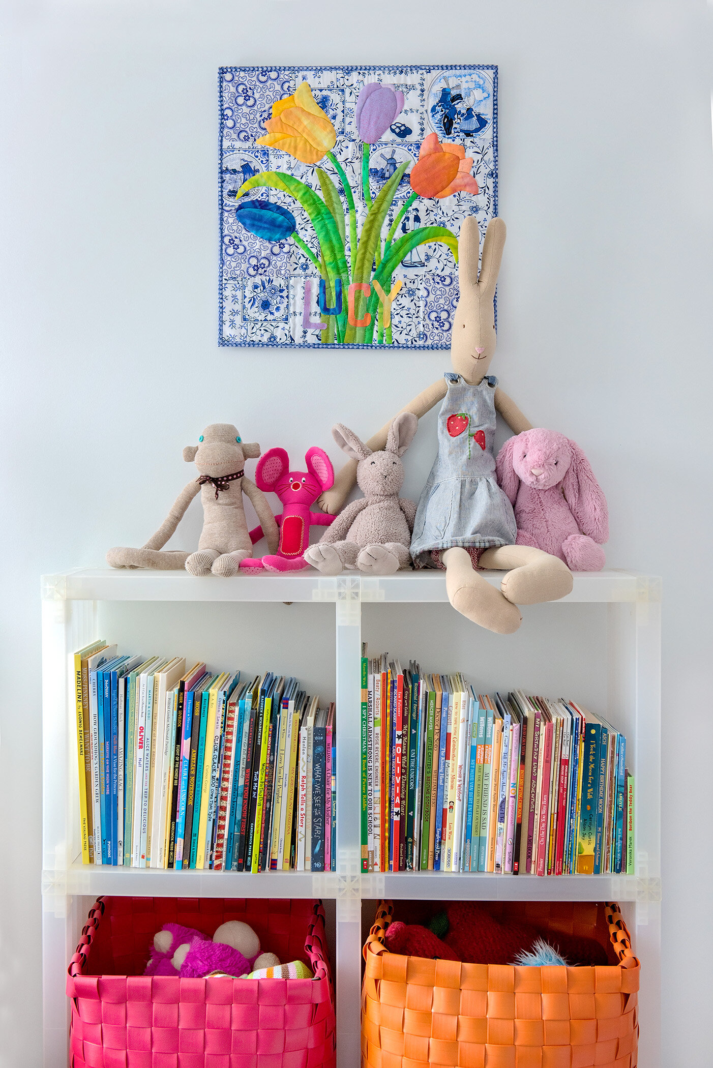
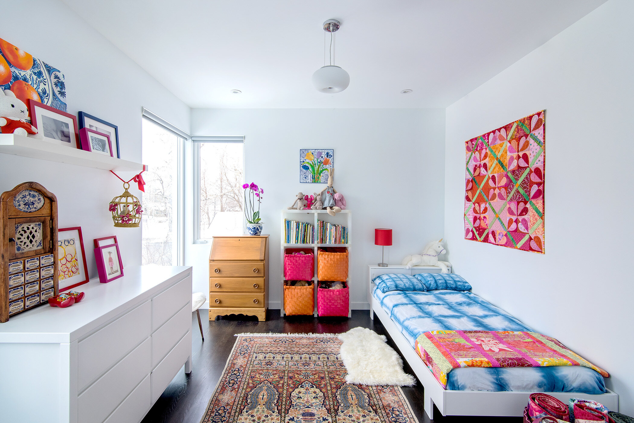
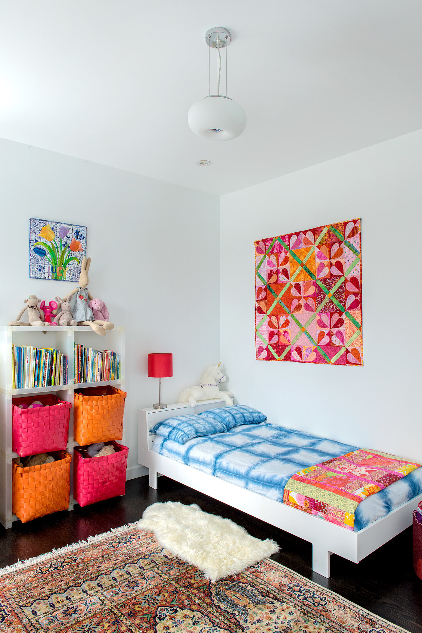
when my daughter was born, she first slept in a small, wooden bassinet (later we cut the legs down and she used it as a dolly bed) and then grew into the white, unisex crib and changing table that originally belonged to her brother. we purchased a clean, modern, “grown up” dresser with similar lines. as she got bigger she moved into his toddler bed and ultimately into a full size bed as well. she inherited her great grandmother’s secretary, which serves as her desk. the dresser has remained in her room throughout all of the updates - she is now ten.
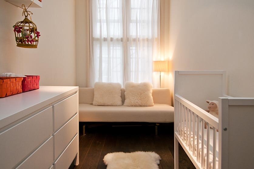
(lucy’s nursery in amsterdam, complete with the wooden bassinet and new, white dresser)
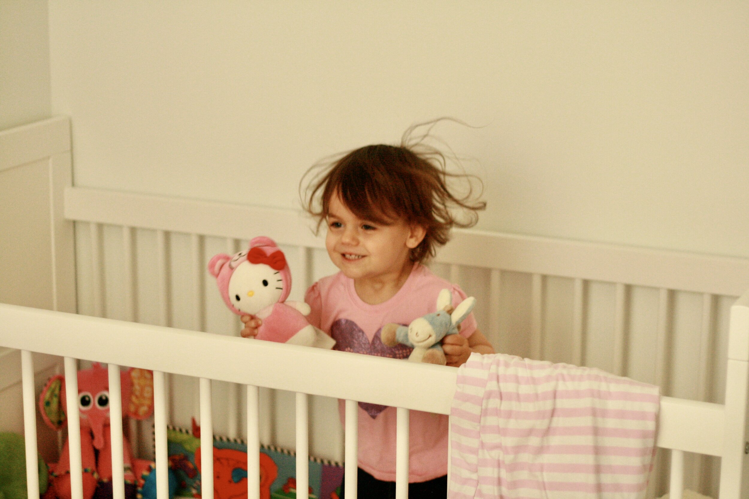
(lucy “napping” in the ikea crib she received from her brother)
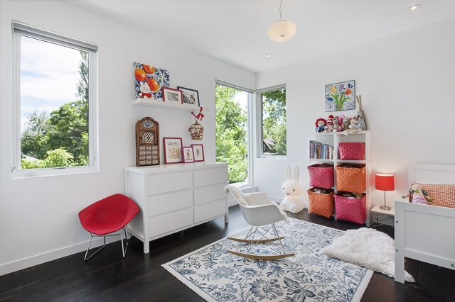
(lucy’s room in boulder once she’d moved into her brother’s toddler bed; photo: bob carmichael)
(redecorating lucy’s room to include the secretary inherited from her great grandma, a new rug and a full sized bed made up with bedding we dyed with indigo in a shibori pattern - she KEPT the family photos… PRAISE JESUS!)
i believe one of the big misnomers of designing children’s rooms is that you must start with a full set of “baby furniture,” move into another new set of “toddler furniture” a few years later, redecorate again with “kid furniture” and ultimately redesign the room with “teen furniture” before your child moves out of the house, at which point you might redo it one last time to create a guest room with “adult furniture.” adhering to this philosophy is both costly and exhausting. it is true that if you start with a dresser engraved with ducks or bunnies or purchase a bed in the shape of a race car, you will need to update as your child grows up. choosing simple pieces that are gender neutral and age ambiguous allows you to both hold onto them longer and pass them down to a child of a different sex.
as in adult bedrooms, the furniture selected for children’s rooms can be long lasting, streamlined and aesthetically adaptable so that as the children grow and their interests change, smaller elements and accents can be swapped out and updated: bedding, lamps, wall art, throw rugs and books. the majority of the larger pieces can remain constant: desks, dressers, bookshelves and ultimately the beds. when the foundation of the room remains constant, redecorating is a far less daunting and expensive project allowing children’s rooms to reflect the ever-changing loves, colors and passions of the boys and girls residing there.
(all photos depicting updated rooms: HBK photography)
to read about our playroom update click here

