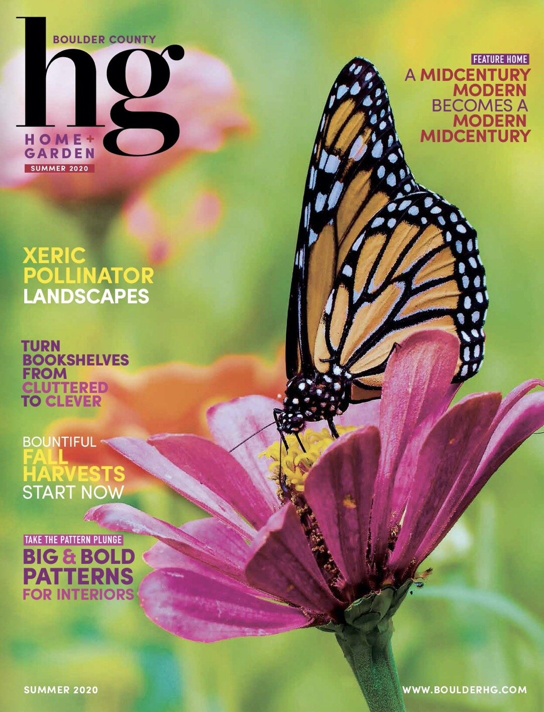
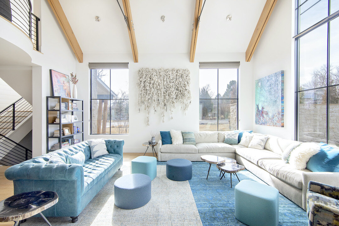
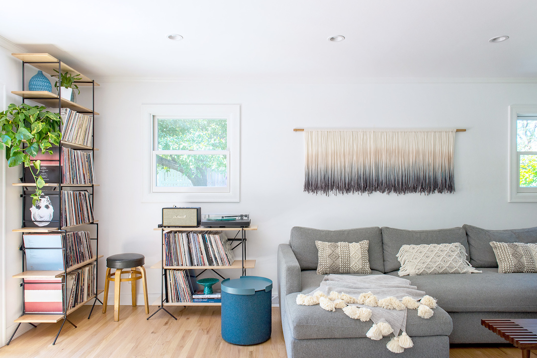
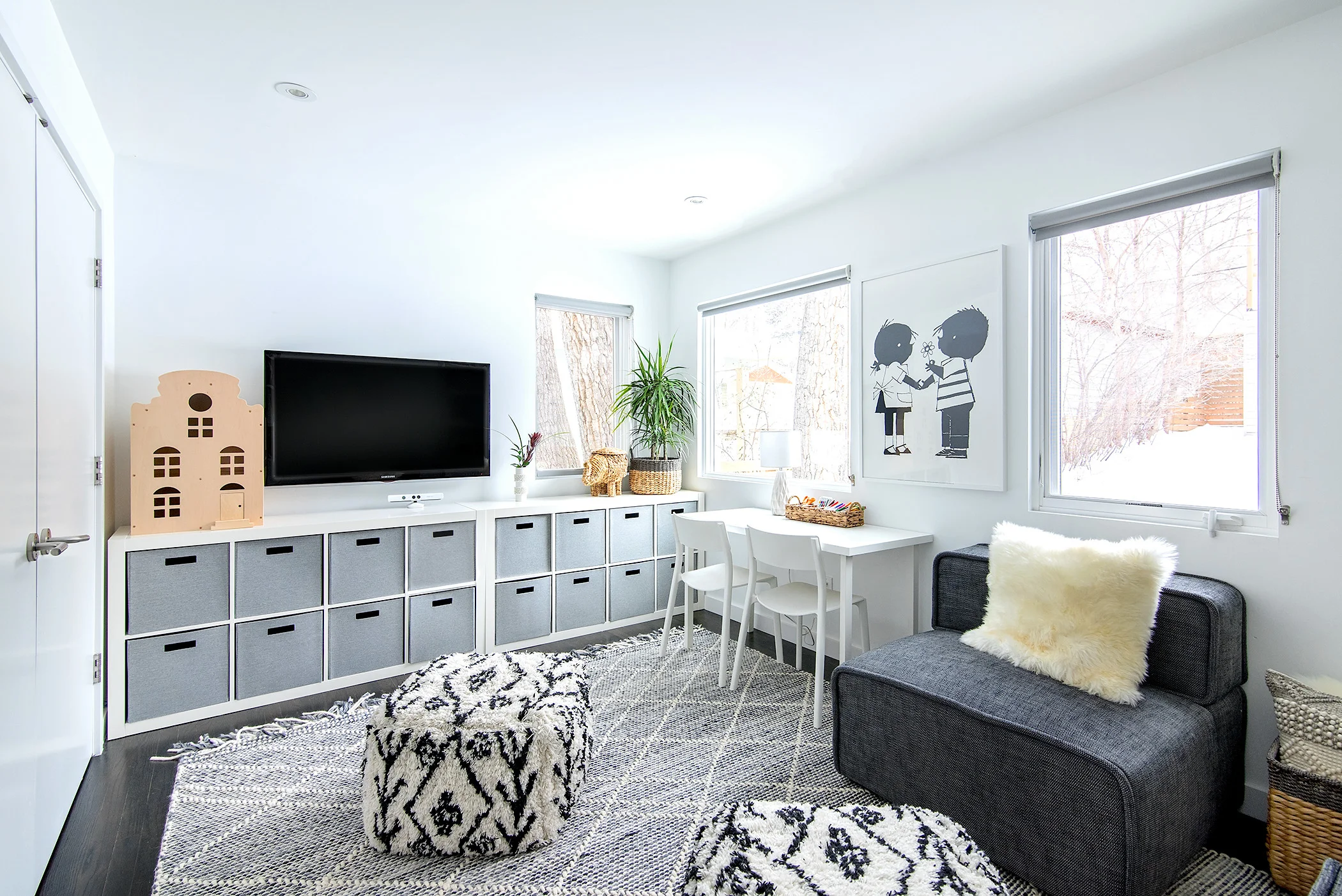
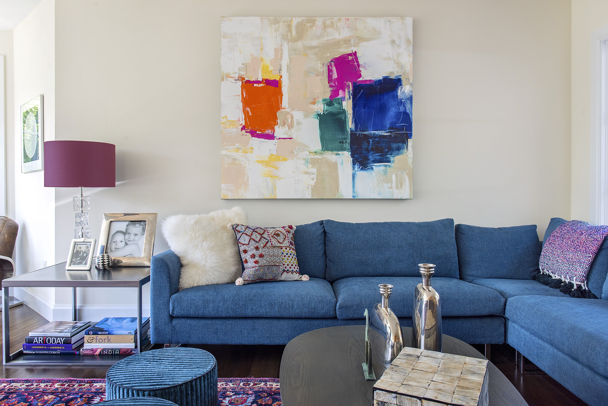
i was so delighted to be interviewed by ruthanne johnson on how to integrate patterns into your home decor for her article “patterns, patterns everywhere” featured in the summer 2020 edition of boulder county home + garden. MANY THANKS to heather knierim of HBK photography for the beautiful photos and to my lovely clients for allowing me to share their spaces… also so exciting to see the beautiful work of sarah kinn that we commissioned for this entry in print.
Read Moreresidential interior
flexible corona homes
last week my daughter had a piano recital on zoom along with two dozen other students. it was great to see her perform (she did a TIP TOP job), but the best part was getting a look into everyone else’s homes. my favorite was the one with the little sister laying on her belly across the top of the sofa with her feet in the air and her chin in her hands. runner up was the cat in the window seat behind the piano napping.
Read Morepublished in voyage denver magazine's most inspiring stories! x0x
i am so honored to be included in voyage denver magazine’s most inspiring stories! THANK YOU sarah miller and voyage denver for giving me the opportunity to share my story! x0x0xx
here is the full article
erica green's fiber art
i first discovered erica green’s work at her “passages” show at the AKA gallery in boulder last year. the viewer was invited to walk between the “walls” of knotted fibers green created that changed from portions so thick with yarn you could not see through them to sparser lengths that allowed you to peek into the next turn. it was an interactive installation meant to engage the viewer both in traveling along the maze-like route and by contributing knots or braids or tears in the fibers at the end of the journey, thereby participating in the art piece and sharing in a collective experience.
Read Morekristin colombano's fog & fury felt
kristin colombano of fog & fury has always been an artist, but the journey that led her to felt making was circuitous and full of serendipity. born and raised in the bay area, kristin studied painting and photography at the san francisco art institute. she began her career working as a graphic designer and photographer. while on a photo assignment for the asia foundation in mongolia, kristin was completely taken by the felt covered yurts - the traditional dwellings of the nomadic people who have been following herds of sheep and yak for thousands of years on the steppes of central asia - dotting the countryside. the yurts are collapsible and are reassembled again and again as the families travel throughout the plains. felt is employed as the cover because it is light weight for easy travel, insulating, durable and fire resistant.
Read Morecorona "gezellig"
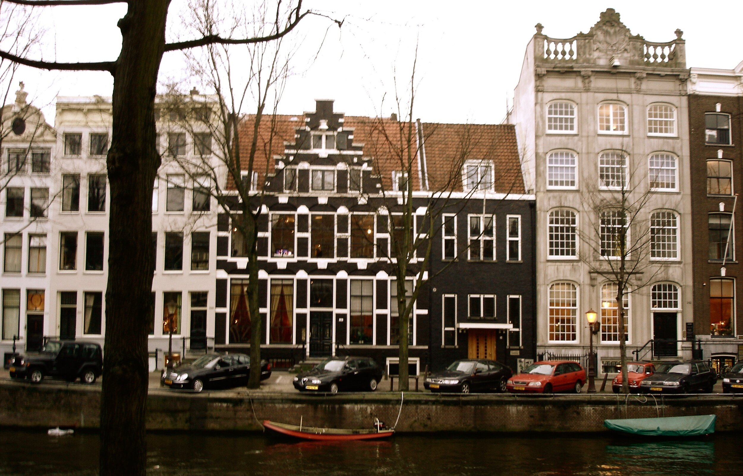
one of my sweetest, most poignant learnings from living in the netherlands for nearly six years is the idea of “gezellig,” the dutch word for coziness. gezellig applies to social concepts like inviting or friendly people, parties, situations and meals, but what i have been really thinking about lately as we all “shelter in place” is how the dutch instilled gezellig in their homes. in a land where it rains at least a portion of most days, our amsterdam neighbors knew how to create welcoming spaces to retreat within and enjoy their families, while the rain drummed outside. corona is pushing us all inside now and we can learn from the comforting, warm interiors of the dutch.
Read Moreartful bookshelves
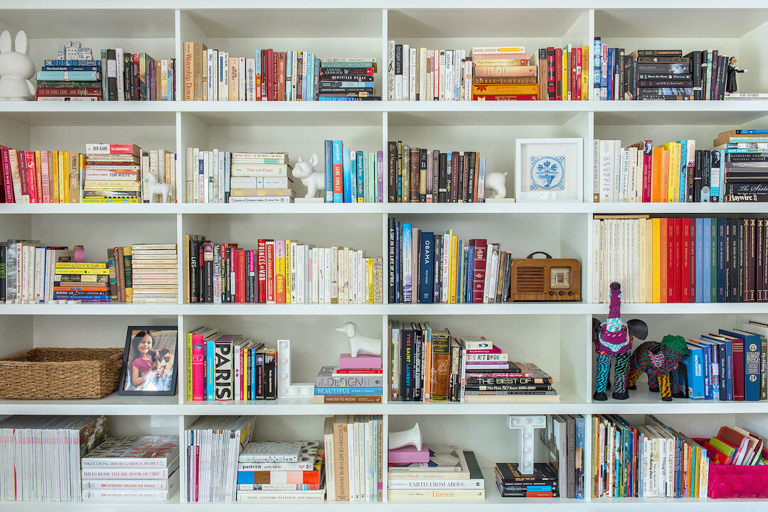
in this time of "social distancing" and "shelter at home" when we are meant to remain within the confines of our houses we probably have a bit more time. it is the PERFECT opportunity for interior improvement projects. channel your boredom and extra energy by reorganizing your bookshelves to maximize their visual impact. thoughtfully arranged bookshelves add life, color, warmth and intimacy to a room. bookshelves can provide amazing insight into your loves, interests, travel, collections and favorite authors, personalizing a home and making it unique. following are tips for turning what is often only a functional aspect of a room into something that enhances, informs and brightens the space.
Read Moreeco-friendly home products... boulder county home + garden, spring issue
i am a bit abashed to admit that my children are the ones who have pushed me to consider how the product choices i make for my home effect the environment. because of them we now have a collection of metal straws (BIG ones so they can be easily cleaned with a little brush), reusable bowl and cup covers that look like my grandmother’s shower caps (used in place of plastic wrap) and cloth napkins for everyday use, rather than paper ones. i DO cringe each time they rub spaghetti sauce or jam on the napkins because of course that means they will need to be washed. “mama, you HAVE to let us wipe our hands - that’s the whole point” they say. so it was serendipitous when i was asked to write an article for boulder county home + garden on eco-conscious home items and furnishings. i had so much fun discovering these kitchen and home decor products that are both visually delightful (MUCH prettier than my shower caps!) AND support conservation and sustainability. THANK YOU to dot & army, MoMA, marley’s monsters, Khala & Co., minna, archive new york, area home, leah singh and coyuchi for your beautiful, creative and thoughtful designs.
Read Morebest of houzz 2020 service award
i LOVE to get prizes… i think this stems from the fact that i wasn’t a sporty kid and didn’t participate in activities that got rewarded with trophies or medals. i may have gotten a couple of “participation” ribbons the summer i was nine and did swim team, but i never placed. so i am thrilled and GRATEFUL to receive this service award again from houzz. i DO wish they would send me a big, fancy ribbon with my name on it or some kind of statue, but an email notice is nice as well. x0x
published in boulder county home + garden
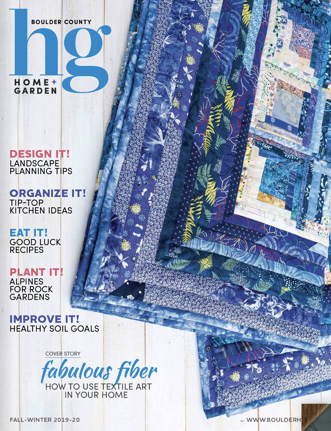
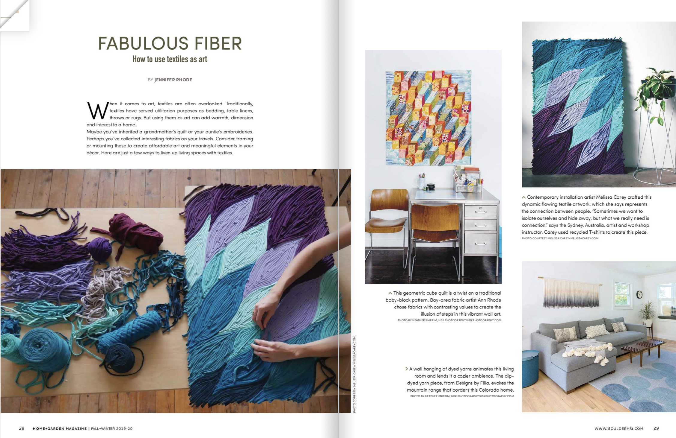
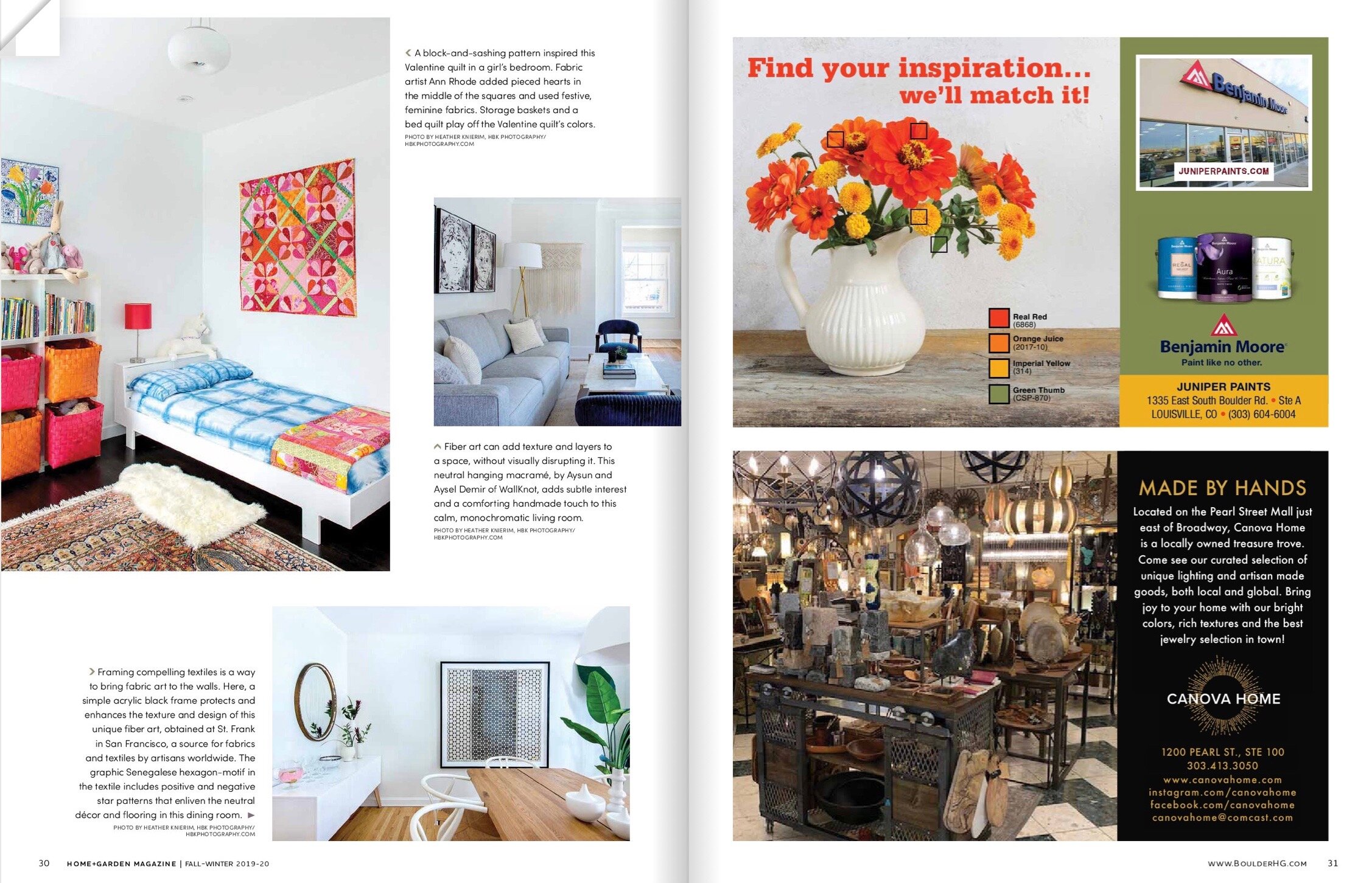
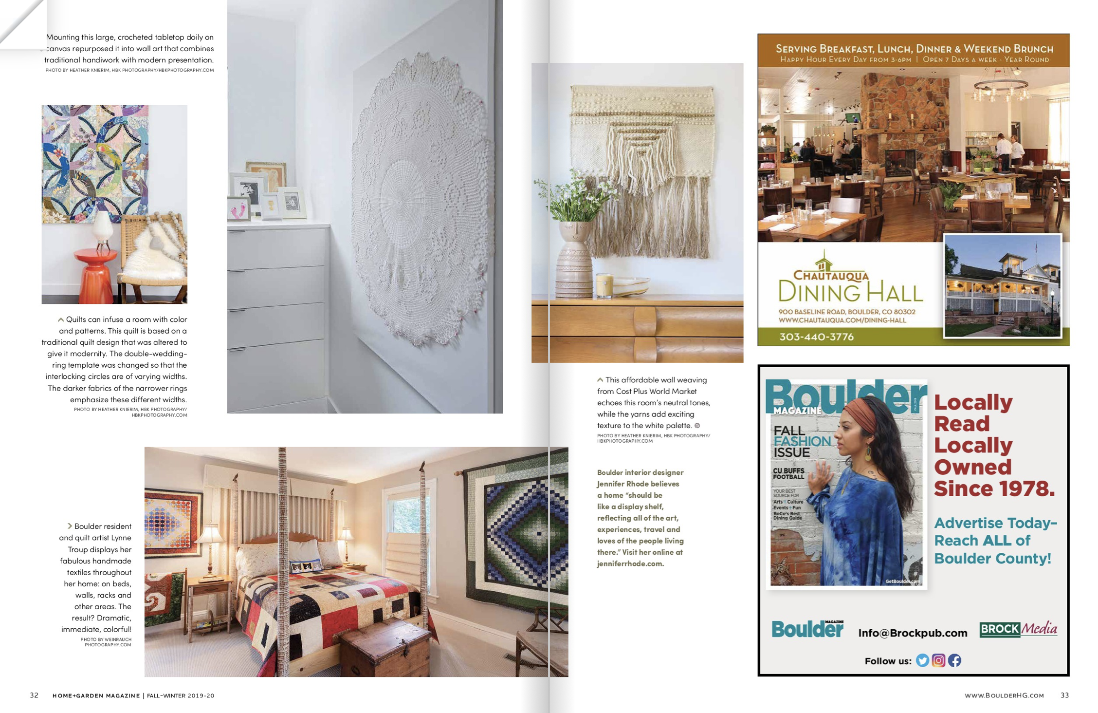
i am so excited that a piece i wrote about using textiles as wall art is the cover story for boulder county home + garden magazine’s fall-winter issue. THANK YOU to heather knierim of HBK photography for the beautiful photos, to my clients for allowing me to share these projects and st. frank and the super talented fiber artists: my mother, aysun and aysel demir of wallknot and designs by filia for their creations.
(*the editor did add two artists to the article - the first and last projects included in the story are not my projects.)
shayna's abstracts
shayna larsen has been doing realistic, soulful watercolor animal portraits for some time. the aspect of the medium shayna finds most compelling is that she doesn’t have full control… she can make a suggestion with her brush and then the paint goes where it will, generating a life of its own.
Read Morealexander calder inspired mobiles
alexander calder is largely credited with creating the “mobile,” a suspended, kinetic sculpture in the early 1930’s. while other artists were also experimenting with moving art (notably man ray’s “obstruction” constructed from wooden coat hangers in 1920 or aleksandr rodchenko’s “oval hanging construction no.12” also from 1920), calder explored and experimented with the art form for decades, creating some of his most recognized works. his mobiles were so dubbed by friend and fellow artist, marcel duchamp, when he was visiting calder’s studio in 1931, “mobile” being a french pun meaning both movement and motive.
Read Morecolor, texture and warmth in south boulder
we created a clean interior envelope of white walls and light blonde flooring to house the eclectic mix of bold colors, varied textures and warm woods in this south boulder home. the owners, a young family of four, decamped from northern california to the front range bringing with them a collection of bright, mid-century graphic prints. these vivid, compelling pieces inspired the color palette in the downstairs living spaces. a gold-hued print set the tone for a family room done in burnt orange and golds featuring a tweedy cayenne loveseat, an orange powder-coated side table and a geometric felt rug.
Read More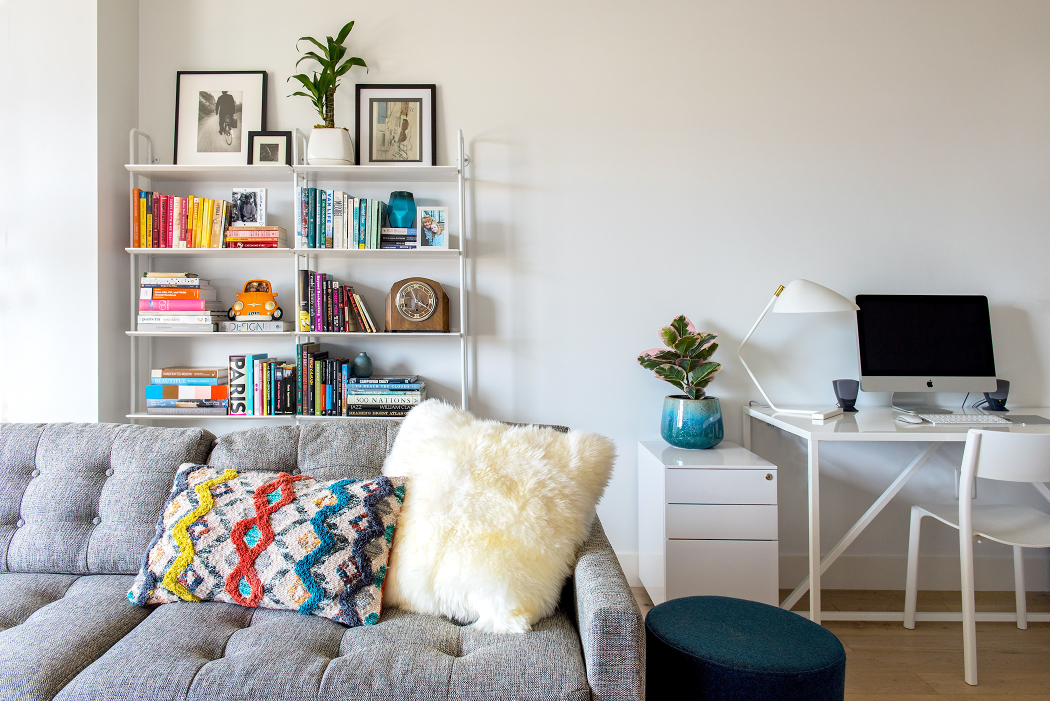
peloton
for this one bedroom apartment in the peloton building we wanted to create both continuity throughout the flat and distinctive, pragmatic, yet warm, inviting spaces for the resident musician. the clean, white walls and pale wood flooring allow the bright colors in the art, patterned rugs, orange velvet lounge chair and textured cushions to stand out in the living room, which doubles as a guest space by virtue of the queen sofa bed. the white, powder-coated desk and bookshelf are both functional and aesthetic, without visually disrupting the living space. mid-century nods are found in the dining table and chairs and nelson bubble lights hanging in the living room and kitchen.
Read Morethe fairy houses of washington avenue
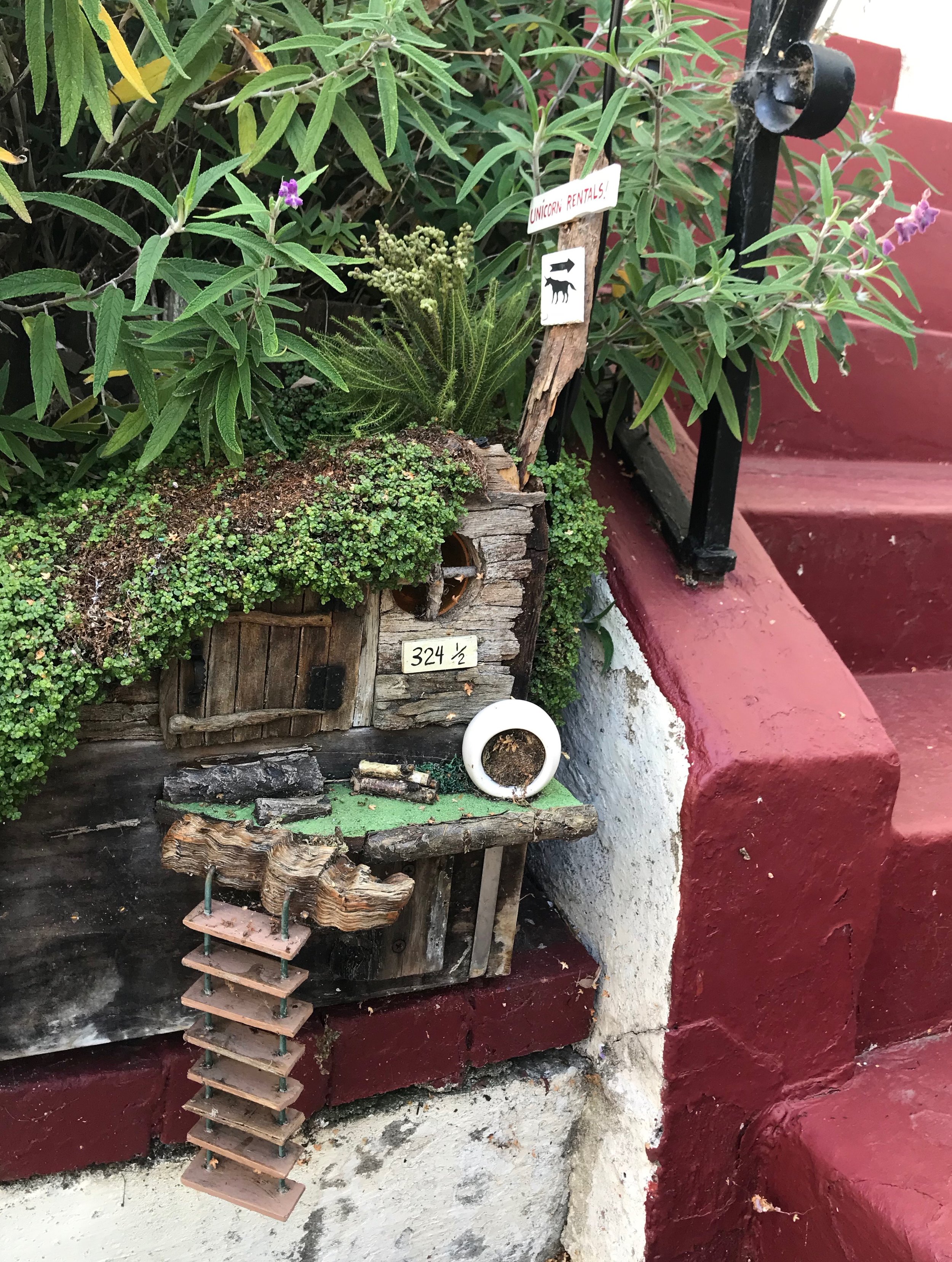
when i was nine years old i got a dollhouse for christmas. it was amazing… my mother had wallpapered some rooms and installed wainscoting in others and together we chose paint colors for the remaining areas. she had purchased a few key furniture pieces to have in place for christmas morning, but the house was mostly bare and i spent the next couple of years furnishing it. there was a shop called mz. mcphizz on solano avenue near my house and i used to walk down there and spend hours looking at the tiny candelabras and picture frames and dishes. they had loads of miniature room set-ups in glass boxes: a music room, a playroom, a parlor… and they were all inhabited by tiny people or little furry gray mice wearing clothes. ultimately, i filled my house with a large extended mouse family, which is funny now as i definitely do not welcome mice in my current house. (we DID get mice in our amsterdam apartment because we were the only family in our building without a cat - theo LOVED seeing them race across a room and i was always startled and horrified.)
Read Morepublished on houzz! x0x
i was so delighted that the editors at houzz decided to feature my playroom project… THANK YOU bryan anthony!
Read Moreplayroom update
as much as i have admonished my children against growing up and getting older, they continue to do it anyway. i miss their dimpled hands and big round cheeks and chiclet teeth and pudgy toes and wobbly walks and uninhibited dances. despite my threats, their limbs have elongated, their knuckle dimples have disappeared, their baby teeth have fallen out and they orange justice and hype, instead of hokey pokey. there ARE some benefits… they are potty trained, they can clean their own noses, they dress themselves and they can even fold their laundry and put it away (when threatened)… i HATE dealing with laundry.
Read Moremodern dining
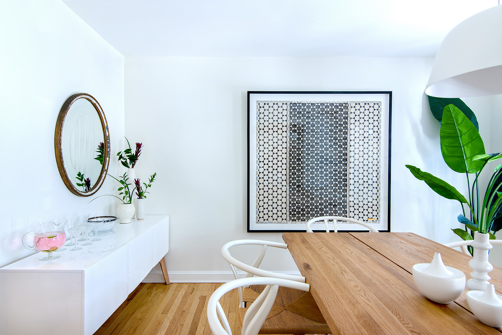
this bright, refreshing dining room is composed of a collection of simple geometrics: the clean, rectangular oak table surrounded by timeless, circular wishbone chairs; the framed senagalese hexagon-motif textile, designed to include both positive and negative stars; the half dome pendant light; the antique oval mirror and the ceramic vessels in a variety of rounded and cylindrical silhouettes. a quiet palette of warm, light woods and crisp whites is punctuated by the graphic black framed textile art. in all, the space is an inviting, eclectic mix of linear and spherical, vintage and modern, dark and light.
Read Moreglitches
i have a few inconvenient glitches. i cannot tell my left from my right. thankfully, i did learn how to hold my hands out in front of me to check which one makes an “L” when i was in pre-school, but somehow i never internalized it, like most people do. so i still use this crutch when navigating the many directional choices throughout any given day. sometimes, this is problematic… if i am driving, and you tell me to turn “right” there is only a 50/50 chance that i will make the correct turn. it is best for you to also point in the direction you want me to go. otherwise, i will have to take my hands off the wheel and double check for my “L”, which probably isn’t the safest. also, i prefer a little lead time. i like that the google maps lady not only verbally tells you which way to proceed, she shows you a picture. i’ve realized that i am more of a visual learner than an auditory processor.
Read Moredellwood
the challenge of this large, rectangular living room was bringing intimacy and continuity to the expansive space. we started with a grand, persian carpet generous enough to unite the room and also to serve as artwork on the floor. we added spacious sectional sofas at opposite corners that mirror each other, defining and clarifying the space. the sofas were joined by rounded, organic-shaped, low tables and accessory seating in the form of the undulating wooden wave bench and the deep teal ottomans.
Read More
