just when it seemed we would all be going to back to work (outside of our homes) the delta arrived and dashed those plans. it might be time to consider how to make your home office space as useful and beautiful as possible so that “going to work” (even if your commute is just downstairs) is a pleasure.
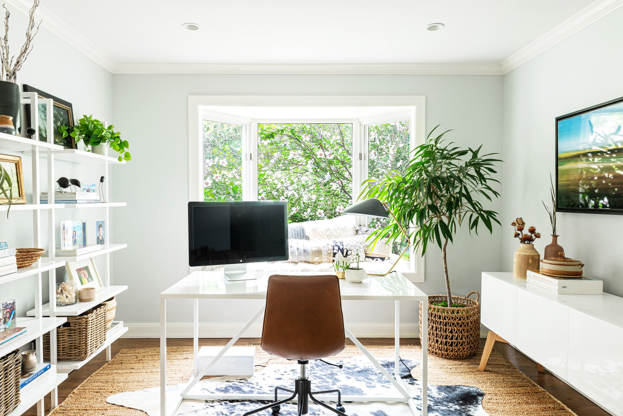
on juniper street, we turned what had been an extra sitting area into a tranquil, highly functional work space that is consistent in palette and tone with the rest of the house. we chose neutrals that ranged from bright, lacquered whites (bookshelves, desk and credenza), off whites and quiet grays (window cushions), natural fibers (baskets and sisal rug), warm, saddle leather (desk chair) to hits of black (hide rug and accessories) that punctuate the room.
the baskets on the lower shelves of the bookcase and the credenza house the less pretty items like the printer and various office supplies. the desk is positioned to capitalize on the lovely garden view and to help the occupant from being distracted by what may be going on in the rest of the house with her school age “colleagues.”
(the overall space)
(even with a big monitor, the desk is generous enough to lay out work papers)
(the baskets are within easy reach in case an extra pencil or post it is needed)
(choosing white furniture for the larger pieces gives the space extra calm)
(green plants, dried grasses and organic shapes are a warm contrast to the clean, white credenza)
(bookshelves can house much more than books… art work, photos, plants, ceramics, small sculptures)
(the perfect place for a coffee break!)
photos: HBK photography


